
What is Framer Motion? Framer Motion is a declarative animation library for React that replaces CSS keyframes with JavaScript objects.
After optimizing animation performance across a dozen enterprise Next.js codebases and dealing with complex hydration mismatches, I’ve seen firsthand how layout jank can destroy user experience. I’ve shipped Framer Motion in production apps handling millions of users. This guide distills those lessons: what actually works, what breaks under pressure, and the patterns worth adopting to ensure smooth hardware acceleration.
TL;DR: Replace
<div>with<motion.div>, define animations withinitial/animate/exitprops, wrap conditionally rendered elements inAnimatePresencewith a uniquekey, and stick totransform/opacityfor 60fps performance on the compositor thread.
Last tested with Motion 12.x (formerly Framer Motion) and Next.js 16.x in March 2026
Getting Started
This guide covers Motion v10+ (formerly known as “Framer Motion”). Most patterns work in v6+, but useAnimate, useInView, and some LazyMotion features require v10. Keep in mind that implementing features like LazyMotion effectively requires proper tree-shaking setup.
Installation
npm install motion
# or, for existing projects using the legacy package name:
npm install framer-motion
# Both packages are maintained and compatible
For Next.js App Router projects, remember that motion components are client-side only. Add the "use client" directive at the top of any file using Framer Motion:
"use client";

import { motion } from "framer-motion";
// New projects (recommended):
import { motion } from "motion/react";
// Existing projects (still works):
import { motion } from "framer-motion";The Mental Model
Replace standard HTML elements with their motion equivalents. A <div> becomes <motion.div>, a <button> becomes <motion.button>. These components accept animation props:
import { motion } from "framer-motion";

function FadeInBox() {
  return (
    <motion.div
      initial={{ opacity: 0 }}
      animate={{ opacity: 1 }}
      transition={{ duration: 0.5 }}
      className="rounded-lg bg-blue-500 p-6"
    >
      I fade in on mount
    </motion.div>
  );
}
The three core props are:
initial: The starting state (can befalseto disable mount animations)animate: The target state to animate towardtransition: How the animation should behave (duration, easing, spring physics)
Copy/Paste Starter Kit
Basic Motion Component:
import { motion } from "framer-motion";

export function SlideIn({ children }: { children: React.ReactNode }) {
  return (
    <motion.div
      initial={{ opacity: 0, y: 20 }}
      animate={{ opacity: 1, y: 0 }}
      transition={{ duration: 0.4, ease: "easeOut" }}
    >
      {children}
    </motion.div>
  );
}
Variants Example:
const containerVariants = {
  hidden: { opacity: 0 },
  visible: {
    opacity: 1,
    transition: {
      staggerChildren: 0.1,
    },
  },
};

const itemVariants = {
  hidden: { opacity: 0, y: 20 },
  visible: { opacity: 1, y: 0 },
};

export function StaggeredList({ items }: { items: string[] }) {
  return (
    <motion.ul variants={containerVariants} initial="hidden" animate="visible">
      {items.map((item) => (
        <motion.li key={item} variants={itemVariants}>
          {item}
        </motion.li>
      ))}
    </motion.ul>
  );
}
AnimatePresence Example:
import { motion, AnimatePresence } from "framer-motion";
import { useState } from "react";

export function ToggleContent() {
  const [isVisible, setIsVisible] = useState(false);

  return (
    <>
      <button onClick={() => setIsVisible(!isVisible)}>Toggle</button>
      <AnimatePresence>
        {isVisible && (
          <motion.div
            key="content"
            initial={{ opacity: 0, height: 0 }}
            animate={{ opacity: 1, height: "auto" }}
            exit={{ opacity: 0, height: 0 }}
          >
            Content that animates in and out
          </motion.div>
        )}
      </AnimatePresence>
    </>
  );
}
Reduced Motion Example:
import { motion, useReducedMotion } from "framer-motion";

export function AccessibleSlideIn({ children }: { children: React.ReactNode }) {
  const shouldReduceMotion = useReducedMotion();

  return (
    <motion.div
      initial={{ opacity: 0, x: shouldReduceMotion ? 0 : -100 }}
      animate={{ opacity: 1, x: 0 }}
      transition={{ duration: shouldReduceMotion ? 0.1 : 0.4 }}
    >
      {children}
    </motion.div>
  );
}
Do/Don’t List
| Do | Don’t |
|---|---|
Use motion.div for animatable elements |
Expect animate/initial props to work on regular div |
Add "use client" in Next.js App Router |
Forget the directive and get cryptic errors |
| Start with simple opacity/transform animations | Jump straight to complex layout animations |
| Test animations on lower-powered devices | Only test on your development machine |
Framer Motion vs Alternatives
How does Framer Motion compare to other animation libraries? Framer Motion offers the best React integration and automatic layout animations, but comes with a larger bundle than CSS-only solutions.
| Feature | Framer Motion | CSS Animations | React Spring | GSAP |
|---|---|---|---|---|
| Bundle Size | ~30kb (full) / ~15kb (lazy) | 0kb | ~25kb | ~60kb |
| Exit Animations | ✅ AnimatePresence | ❌ Manual JS required | ⚠️ useTransition (complex) | ✅ Manual timeline |
| Layout Animations | ✅ Automatic FLIP | ❌ Not supported | ❌ Not supported | ⚠️ Manual FLIP |
| Gesture Support | ✅ Built-in drag, hover, tap | ❌ JS required | ❌ Separate library | ✅ Draggable plugin |
| Learning Curve | Medium | Low | High (physics model) | High (timeline API) |
| React Integration | Native (declarative) | CSS-in-JS needed | Native | Wrapper/refs needed |
| SSR Support | ✅ With hydration handling | ✅ Native | ✅ Native | ⚠️ Complex setup |
| TypeScript | ✅ First-class | N/A | ✅ First-class | ⚠️ @types package |
When to choose Framer Motion: You need exit animations, layout animations, or gesture support without writing imperative code.
When to choose alternatives:
- CSS Animations: Simple hover states, loading spinners. No library needed
- React Spring: Physics-based animations where you need precise spring control
- GSAP: Complex timelines, SVG morphing, or ScrollTrigger-heavy pages
When to Use Each Animation Approach
Framer Motion offers multiple ways to animate. Here’s when to use each:
Use Inline animate Props When:
- The animation is simple (fade, slide, scale)
- It’s a one-off animation not reused elsewhere
- You’re animating based on a single boolean state
// Simple fade-in on mount
<motion.div animate={{ opacity: 1 }} initial={{ opacity: 0 }} />
Use Variants When:
- Parent and child components need coordinated animations
- You want staggered list animations with
staggerChildren - The same animation states are reused across components
- You need named states like “hidden”, “visible”, “exit”
// Coordinated parent-child animations
<motion.ul variants={containerVariants} initial="hidden" animate="visible">
  <motion.li variants={itemVariants} />
</motion.ul>
Use useAnimate When:
- Animations depend on async operations (API calls, clipboard copy)
- You need precise sequencing control beyond variants
- The animation is imperative. It fires once and doesn’t persist in state
// Sequence after async operation
const [scope, animate] = useAnimate();
await copyToClipboard();
await animate(scope.current, { scale: 1.1 });
Use Layout Animations When:
- Element size or position changes based on content/state
- You’re building reorderable lists or grids
- You need “shared element” transitions between views with
layoutId
// Automatic size/position animation
<motion.div layout style={{ width: isExpanded ? 400 : 200 }} />
Use useMotionValue + useTransform When:
- Animations should respond to continuous input (scroll, drag position)
- You need to derive one animated value from another
- Performance is critical. This approach avoids React re-renders
// Scroll-linked parallax
const { scrollY } = useScroll();
const opacity = useTransform(scrollY, [0, 300], [1, 0]);
Core Concepts (variants, gestures)
What are Framer Motion Variants? Variants are named JavaScript objects that define animation states (like ‘hidden’ or ‘visible’) and allow you to orchestrate complex parent-child animation sequences in Framer Motion.
Variants: Orchestrated Animations
Variants let you define named animation states and coordinate animations across parent and child components. Instead of passing animation objects directly, you reference variant names as strings.
import { motion, Variants } from "framer-motion";

const cardVariants: Variants = {
  offscreen: {
    y: 50,
    opacity: 0,
  },
  onscreen: {
    y: 0,
    opacity: 1,
    transition: {
      type: "spring",
      bounce: 0.4,
      duration: 0.8,
    },
  },
};

export function AnimatedCard({ children }: { children: React.ReactNode }) {
  return (
    <motion.div
      variants={cardVariants}
      initial="offscreen"
      whileInView="onscreen"
      viewport={{ once: true, amount: 0.3 }}
      className="rounded-xl bg-white p-6 shadow-lg"
    >
      {children}
    </motion.div>
  );
}
The Variants type from Framer Motion provides full TypeScript support for variant objects.
Parent-Child Orchestration
Variants flow down through nested motion components. Children automatically inherit variant names from parents, enabling staggered animations without explicit coordination:
const containerVariants: Variants = {
  hidden: { opacity: 0 },
  visible: {
    opacity: 1,
    transition: {
      delayChildren: 0.3,
      staggerChildren: 0.1,
      // Pro tip: use staggerDirection: -1 to reverse the stagger order
    },
  },
};

const itemVariants: Variants = {
  hidden: { y: 20, opacity: 0 },
  visible: {
    y: 0,
    opacity: 1,
    transition: { type: "spring", stiffness: 100 },
  },
};

export function NavigationMenu({ items }: { items: NavItem[] }) {
  return (
    <motion.nav variants={containerVariants} initial="hidden" animate="visible">
      {items.map((item) => (
        <motion.a
          key={item.href}
          href={item.href}
          variants={itemVariants}
          className="block px-4 py-2 hover:bg-gray-100"
        >
          {item.label}
        </motion.a>
      ))}
    </motion.nav>
  );
}
Notice that child motion.a elements don’t need initial or animate props. They inherit the variant names from the parent and use their own itemVariants to define what those states mean.
Gestures: Interactive Animations
Framer Motion provides gesture props that make interactive animations trivial:
export function InteractiveButton({ children }: { children: React.ReactNode }) {
  return (
    <motion.button
      whileHover={{ scale: 1.05 }}
      whileTap={{ scale: 0.95 }}
      transition={{ type: "spring", stiffness: 400, damping: 17 }}
      className="rounded-lg bg-indigo-600 px-6 py-3 text-white"
    >
      {children}
    </motion.button>
  );
}
Drag Gestures
The drag prop enables draggable elements with physics-based behavior:
export function DraggableCard() {
  return (
    <motion.div
      drag
      dragConstraints={{ left: -100, right: 100, top: -50, bottom: 50 }}
      dragElastic={0.2}
      whileDrag={{ scale: 1.1, cursor: "grabbing" }}
      className="h-32 w-32 cursor-grab rounded-xl bg-gradient-to-br from-purple-500 to-pink-500"
    />
  );
}
For constrained dragging within a parent container:
import { motion } from "framer-motion";
import { useRef } from "react";

export function DraggableWithinBounds() {
  const constraintsRef = useRef<HTMLDivElement>(null);

  return (
    <div ref={constraintsRef} className="h-64 w-full rounded-lg bg-gray-100">
      <motion.div
        drag
        dragConstraints={constraintsRef}
        dragMomentum={false}
        className="h-16 w-16 rounded-lg bg-blue-500"
      />
    </div>
  );
}
Pointer-Friendly UX Patterns
When building touch-friendly interfaces, combine gestures thoughtfully:
export function SwipeableCard({ onDismiss }: { onDismiss: () => void }) {
  return (
    <motion.div
      drag="x"
      dragConstraints={{ left: 0, right: 0 }}
      onDragEnd={(_, info) => {
        if (Math.abs(info.offset.x) > 100) {
          onDismiss();
        }
      }}
      whileTap={{ cursor: "grabbing" }}
      className="rounded-xl bg-white p-4 shadow-lg"
    >
      Swipe to dismiss
    </motion.div>
  );
}
Scroll Animations
How do I create scroll-linked animations in Framer Motion? Use the useScroll hook to get MotionValue objects representing scroll progress (0 to 1), then useTransform to map those values to animation properties.
The useScroll Hook
The useScroll hook returns MotionValue objects representing scroll progress.
import { motion, useScroll } from "framer-motion";

export function ScrollProgressBar() {
  // Track page scroll progress (0 to 1)
  const { scrollYProgress } = useScroll();

  return (
    <motion.div
      style={{ scaleX: scrollYProgress }}
      className="fixed left-0 right-0 top-0 z-50 h-1 origin-left bg-blue-500"
    />
  );
}
For tracking scroll within a specific container:
import { motion, useScroll } from "framer-motion";
import { useRef } from "react";

export function ContainerScrollProgress() {
  const containerRef = useRef<HTMLDivElement>(null);

  const { scrollYProgress } = useScroll({
    container: containerRef,
  });

  return (
    <div ref={containerRef} className="h-96 overflow-y-auto">
      <motion.div style={{ opacity: scrollYProgress }}>
        Content that fades in as you scroll
      </motion.div>
    </div>
  );
}
Mapping Scroll to Animations with useTransform
The useTransform hook maps one range of values to another. Perfect for creating parallax effects:
import { motion, useScroll, useTransform } from "framer-motion";

export function ParallaxHero() {
  const { scrollY } = useScroll();

  // Map scroll position to y offset (slower than scroll = parallax)
  const y = useTransform(scrollY, [0, 500], [0, 150]);
  const opacity = useTransform(scrollY, [0, 300], [1, 0]);

  return (
    <motion.div
      style={{ y, opacity }}
      className="flex h-screen items-center justify-center bg-gradient-to-b from-purple-600 to-blue-600"
    >
      <h1 className="text-6xl font-bold text-white">Parallax Hero</h1>
    </motion.div>
  );
}
Scroll-Triggered Element Animations
Track when a specific element enters the viewport using the target option:
import { motion, useScroll, useTransform } from "framer-motion";
import { useRef } from "react";

export function RevealOnScroll({ children }: { children: React.ReactNode }) {
  const ref = useRef<HTMLDivElement>(null);

  const { scrollYProgress } = useScroll({
    target: ref,
    offset: ["start end", "end start"], // When element enters/leaves viewport
  });

  const opacity = useTransform(scrollYProgress, [0, 0.3, 0.7, 1], [0, 1, 1, 0]);
  const scale = useTransform(scrollYProgress, [0, 0.3], [0.8, 1]);

  return (
    <motion.div ref={ref} style={{ opacity, scale }}>
      {children}
    </motion.div>
  );
}
For simpler visibility detection without scroll-linked values, use the useInView hook:
import { motion, useInView } from "framer-motion";
import { useRef } from "react";

export function FadeInWhenVisible({ children }: { children: React.ReactNode }) {
  const ref = useRef<HTMLDivElement>(null);
  const isInView = useInView(ref, { once: true, margin: "-100px" });

  return (
    <motion.div
      ref={ref}
      initial={{ opacity: 0, y: 50 }}
      animate={isInView ? { opacity: 1, y: 0 } : { opacity: 0, y: 50 }}
      transition={{ duration: 0.5 }}
    >
      {children}
    </motion.div>
  );
}
Layout Animations
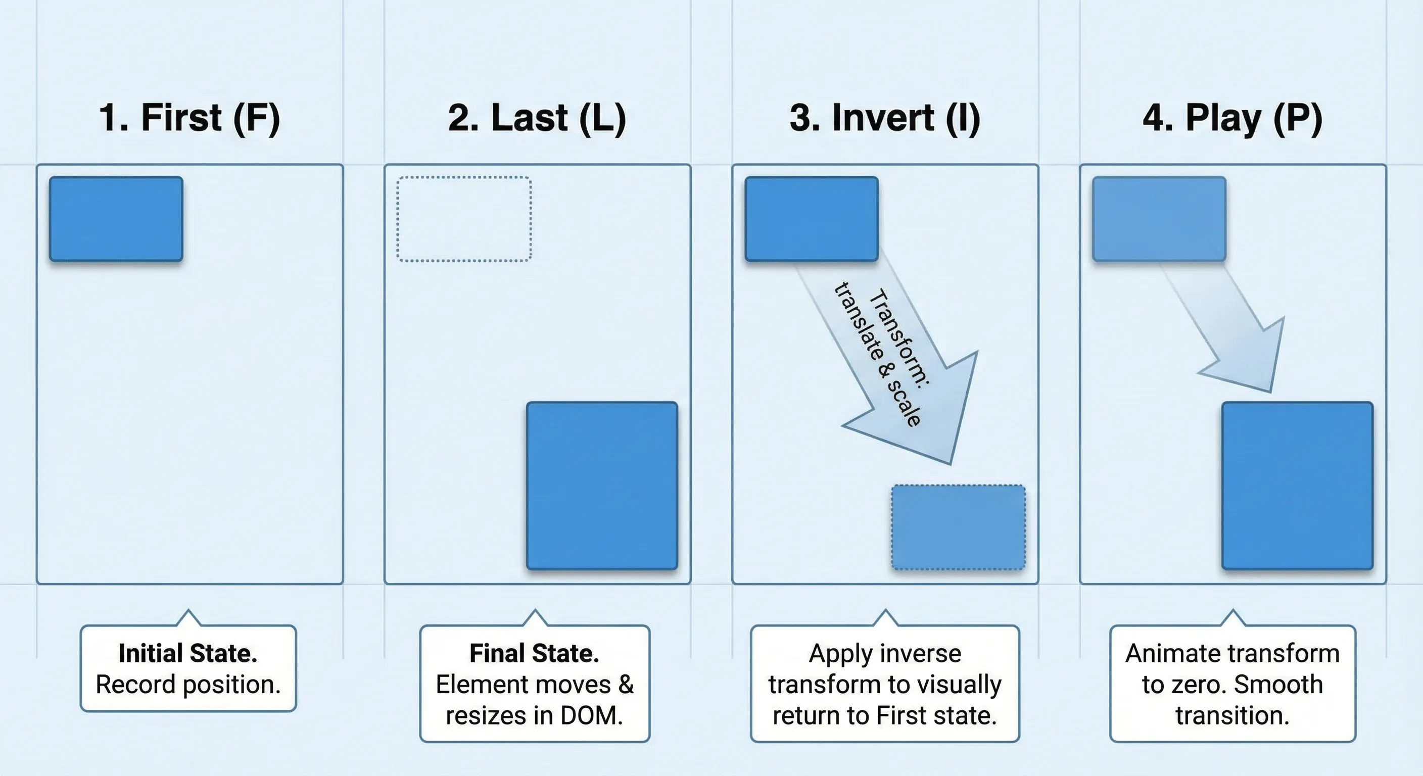
What is the FLIP Animation Technique? The FLIP (First, Last, Invert, Play) technique is an animation pattern that pre-calculates layout changes and uses CSS transforms to animate elements efficiently without triggering expensive browser layout recalculations. Framer Motion uses this under the hood for the layout prop to utilize hardware acceleration and the will-change CSS property dynamically.
import { motion } from "framer-motion";
import { useState } from "react";

export function ExpandableCard() {
  const [isExpanded, setIsExpanded] = useState(false);

  return (
    <motion.div
      layout
      onClick={() => setIsExpanded(!isExpanded)}
      className={`cursor-pointer rounded-xl bg-white shadow-lg ${
        isExpanded ? "p-8" : "p-4"
      }`}
      style={{ width: isExpanded ? 400 : 200 }}
    >
      <motion.h3 layout="position" className="font-bold">
        {/* layout="position" prevents text from scaling/squishing during the box resize */}
        Click to expand
      </motion.h3>
      {isExpanded && (
        <motion.p
          initial={{ opacity: 0 }}
          animate={{ opacity: 1 }}
          className="mt-4 text-gray-600"
        >
          Additional content appears here with a smooth animation.
        </motion.p>
      )}
    </motion.div>
  );
}
List Reordering
Layout animations enable smooth list reordering with the Reorder component:
import { motion, Reorder } from "framer-motion";
import { useState } from "react";

interface Task {
  id: string;
  title: string;
}

export function ReorderableTaskList() {
  const [tasks, setTasks] = useState<Task[]>([
    { id: "1", title: "Review pull requests" },
    { id: "2", title: "Update documentation" },
    { id: "3", title: "Fix accessibility issues" },
  ]);

  return (
    <Reorder.Group
      axis="y"
      values={tasks}
      onReorder={setTasks}
      className="space-y-2"
    >
      {tasks.map((task) => (
        <Reorder.Item
          key={task.id}
          value={task}
          className="cursor-grab rounded-lg bg-white p-4 shadow active:cursor-grabbing"
        >
          {task.title}
        </Reorder.Item>
      ))}
    </Reorder.Group>
  );
}
Shared Layout Animations with layoutId
The layoutId prop creates “magic motion” effects where two separate elements animate between each other:
import { motion, AnimatePresence } from "framer-motion";
import { useState } from "react";

interface Item {
  id: string;
  title: string;
  description: string;
}

export function ExpandableGrid({ items }: { items: Item[] }) {
  const [selectedId, setSelectedId] = useState<string | null>(null);
  const selectedItem = items.find((item) => item.id === selectedId);

  return (
    <>
      <div className="grid grid-cols-3 gap-4">
        {items.map((item) => (
          <motion.div
            key={item.id}
            layoutId={item.id}
            onClick={() => setSelectedId(item.id)}
            className="cursor-pointer rounded-xl bg-white p-4 shadow-lg"
          >
            <motion.h3 layoutId={`title-${item.id}`}>{item.title}</motion.h3>
          </motion.div>
        ))}
      </div>

      <AnimatePresence>
        {selectedId && selectedItem && (
          <motion.div
            layoutId={selectedId}
            className="fixed inset-0 z-50 flex items-center justify-center"
            onClick={() => setSelectedId(null)}
          >
            <motion.div className="max-w-lg rounded-xl bg-white p-8 shadow-2xl">
              <motion.h3
                layoutId={`title-${selectedId}`}
                className="text-2xl font-bold"
              >
                {selectedItem.title}
              </motion.h3>
              <motion.p
                initial={{ opacity: 0 }}
                animate={{ opacity: 1 }}
                exit={{ opacity: 0 }}
                className="mt-4"
              >
                {selectedItem.description}
              </motion.p>
            </motion.div>
          </motion.div>
        )}
      </AnimatePresence>
    </>
  );
}
Layout Animation Options
The layout prop accepts different values for specific behaviors:
layout={true}- Animate both position and sizelayout="position"- Only animate position (useful for images/text that shouldn’t scale)layout="size"- Only animate size changes
// For images that shouldn't distort during layout changes
<motion.img
  layout="position"
  src="/avatar.jpg"
  className="h-16 w-16 rounded-full"
/>
Advanced: Scrollable Containers and Fixed Elements
When animating within scrollable containers, add layoutScroll to account for scroll offset:
<motion.div layoutScroll className="h-96 overflow-y-auto">
  {items.map((item) => (
    <motion.div key={item.id} layout>
      {item.content}
    </motion.div>
  ))}
</motion.div>
For fixed-position containers, use layoutRoot:
<motion.div layoutRoot className="fixed left-0 top-0">
  <motion.div layout>
    Content that animates correctly within fixed container
  </motion.div>
</motion.div>
Anti-Pattern: Accidental Layout Triggers
A common mistake is animating CSS properties that trigger browser layout recalculations, defeating the performance benefits:
// ❌ Bad: Animating width triggers layout every frame
<motion.div
  animate={{ width: isExpanded ? 400 : 200 }}
  className="bg-white rounded-lg"
/>

// ✅ Good: Use layout prop for automatic transform-based animation
<motion.div
  layout
  style={{ width: isExpanded ? 400 : 200 }}
  className="bg-white rounded-lg"
/>
Exit Animations
Why don’t my Framer Motion exit animations work? Exit animations require three things: (1) AnimatePresence wraps the conditional (not inside it), (2) the motion component has a unique key prop, and (3) the motion component is a direct child of AnimatePresence.
// ❌ Wrong: AnimatePresence inside the conditional
{
  isVisible && (
    <AnimatePresence>
      <motion.div exit={{ opacity: 0 }}>Content</motion.div>
    </AnimatePresence>
  );
}

// ✅ Correct: AnimatePresence wraps the conditional
<AnimatePresence>
  {isVisible && (
    <motion.div key="content" exit={{ opacity: 0 }}>
      Content
    </motion.div>
  )}
</AnimatePresence>;
Basic Exit Animation Pattern
import { motion, AnimatePresence } from "framer-motion";
import { useState } from "react";

export function NotificationToast() {
  const [isVisible, setIsVisible] = useState(true);

  return (
    <AnimatePresence>
      {isVisible && (
        <motion.div
          key="toast"
          initial={{ opacity: 0, y: 50, scale: 0.9 }}
          animate={{ opacity: 1, y: 0, scale: 1 }}
          exit={{ opacity: 0, y: 20, scale: 0.9 }}
          transition={{ type: "spring", damping: 25, stiffness: 300 }}
          className="fixed bottom-4 right-4 rounded-lg bg-green-500 px-6 py-3 text-white shadow-lg"
        >
          <p>Changes saved successfully!</p>
          <button
            onClick={() => setIsVisible(false)}
            className="ml-4 text-green-100 hover:text-white"
          >
            Dismiss
          </button>
        </motion.div>
      )}
    </AnimatePresence>
  );
}
Modal with Backdrop Example
A complete modal implementation with coordinated exit animations:
import { motion, AnimatePresence } from "framer-motion";

interface ModalProps {
  isOpen: boolean;
  onClose: () => void;
  children: React.ReactNode;
}

const backdropVariants = {
  hidden: { opacity: 0 },
  visible: { opacity: 1 },
};

const modalVariants = {
  hidden: { opacity: 0, scale: 0.95, y: 20 },
  visible: {
    opacity: 1,
    scale: 1,
    y: 0,
    transition: { type: "spring", damping: 25, stiffness: 300 },
  },
  exit: {
    opacity: 0,
    scale: 0.95,
    y: 20,
    transition: { duration: 0.2 },
  },
};

export function Modal({ isOpen, onClose, children }: ModalProps) {
  return (
    <AnimatePresence>
      {isOpen && (
        <>
          <motion.div
            key="backdrop"
            variants={backdropVariants}
            initial="hidden"
            animate="visible"
            exit="hidden"
            onClick={onClose}
            className="fixed inset-0 z-40 bg-black/50"
          />
          <motion.div
            key="modal"
            variants={modalVariants}
            initial="hidden"
            animate="visible"
            exit="exit"
            className="fixed inset-0 z-50 flex items-center justify-center p-4"
          >
            <div className="w-full max-w-md rounded-xl bg-white p-6 shadow-2xl">
              {children}
            </div>
          </motion.div>
        </>
      )}
    </AnimatePresence>
  );
}
Animated List Item Removal
For lists where items can be added or removed:
import { motion, AnimatePresence } from "framer-motion";

interface Notification {
  id: string;
  message: string;
}

export function NotificationStack({
  notifications,
  onDismiss,
}: {
  notifications: Notification[];
  onDismiss: (id: string) => void;
}) {
  return (
    <div className="fixed right-4 top-4 z-50 space-y-2">
      <AnimatePresence mode="popLayout">
        {notifications.map((notification) => (
          <motion.div
            key={notification.id}
            layout
            initial={{ opacity: 0, x: 100, scale: 0.9 }}
            animate={{ opacity: 1, x: 0, scale: 1 }}
            exit={{ opacity: 0, x: 100, scale: 0.9 }}
            transition={{ type: "spring", damping: 25, stiffness: 300 }}
            className="min-w-[300px] rounded-lg bg-white p-4 shadow-lg"
          >
            <p>{notification.message}</p>
            <button
              onClick={() => onDismiss(notification.id)}
              className="mt-2 text-gray-400 hover:text-gray-600"
            >
              Dismiss
            </button>
          </motion.div>
        ))}
      </AnimatePresence>
    </div>
  );
}
The mode="popLayout" prop ensures remaining items animate smoothly when one is removed.
Route Transitions
For page transitions in Next.js or React Router, wrap your route content.
"use client";

// In your layout or app component
import { AnimatePresence, motion } from "framer-motion";
import { usePathname } from "next/navigation";

export function PageTransitionLayout({
  children,
}: {
  children: React.ReactNode;
}) {
  const pathname = usePathname();

  return (
    <AnimatePresence mode="wait">
      <motion.main
        key={pathname}
        initial={{ opacity: 0, y: 20 }}
        animate={{ opacity: 1, y: 0 }}
        exit={{ opacity: 0, y: -20 }}
        transition={{ duration: 0.3 }}
      >
        {children}
      </motion.main>
    </AnimatePresence>
  );
}
View Transitions API: The Native Alternative
The browser’s View Transitions API provides page transition animations without JavaScript—ideal for simple cross-fades and server-rendered pages. Use Motion instead for choreographed sequences, shared layout animations, or gesture-driven transitions.
Performance Tips
Understanding browser rendering helps you make informed animation decisions. Janky animations hurt UX more than no animations.
The Rendering Pipeline
According to web.dev’s animation guide, browsers render in three main steps:
- Layout: Calculate element geometry (triggered by
width,height,margin,padding,top,left) - Paint: Draw pixels for each layer (triggered by
background-color,border-radius,box-shadow) - Composite: Combine layers on the GPU (triggered by
transform,opacity,filter)
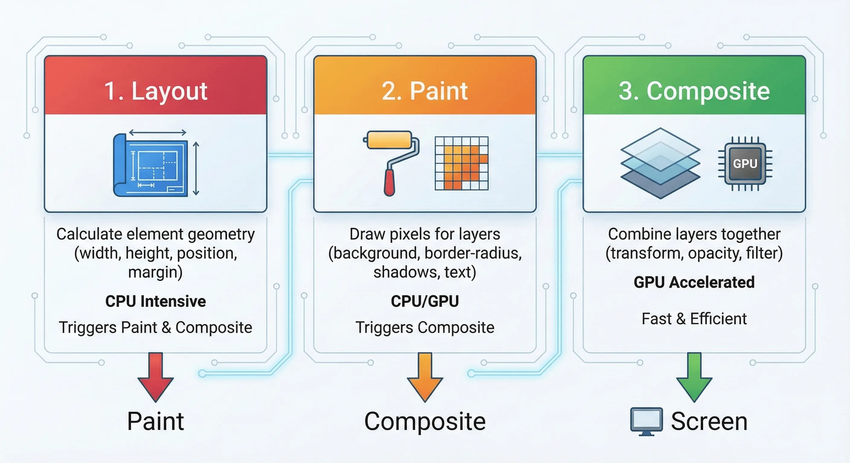
Triggering an earlier step forces all subsequent steps to run. Composite-only animations are the most performant because they skip layout and paint entirely.
Prefer Transform and Opacity
The Motion performance tier list categorizes animations by performance impact.
// ✅ S-Tier: Compositor-only, hardware accelerated
<motion.div
  animate={{
    x: 100,        // transform: translateX
    y: 50,         // transform: translateY
    scale: 1.1,    // transform: scale
    rotate: 45,    // transform: rotate
    opacity: 0.5   // opacity
  }}
/>

// ❌ D-Tier: Triggers layout every frame
<motion.div
  animate={{
    width: 200,    // Triggers layout
    height: 100,   // Triggers layout
    marginLeft: 20 // Triggers layout
  }}
/>
Understanding will-change
The CSS will-change property hints to the browser that an element will animate, allowing it to optimize ahead of time by promoting the element to its own compositor layer.
// Framer Motion handles this automatically, but for custom CSS:
<motion.div style={{ willChange: "transform" }} whileHover={{ scale: 1.05 }} />
Caution: Don’t add will-change to many elements. Each creates a new GPU layer, consuming memory. Only use it on elements actively animating, and let Framer Motion manage it when possible.
Code Splitting with LazyMotion
Framer Motion is powerful, but that power comes with bytes. The full library is about 30-50kb gzipped.
Use LazyMotion with the m component to drastically reduce initial bundle size:
import { LazyMotion, domAnimation, m } from "framer-motion";

// 1. Replace <motion.div> with <m.div>
// 2. Wrap your app (or feature) in <LazyMotion>

function App({ children }: { children: React.ReactNode }) {
  return <LazyMotion features={domAnimation}>{children}</LazyMotion>;
}

// Inside any component:
// ⚠️ Important: <m.div> will NOT animate unless wrapped in <LazyMotion> somewhere up the tree!
function FadeIn({ children }: { children: React.ReactNode }) {
  return (
    <m.div initial={{ opacity: 0 }} animate={{ opacity: 1 }}>
      {children}
    </m.div>
  );
}
Feature Bundles:
domAnimation(about 15kb): Covers animations, transitions, and exit. Use this for most apps.domMax(about 27kb): Adds layout animations, drag, and more. Only import if you need these features.
For even more control, dynamically import features:
import { LazyMotion, m } from "framer-motion";

function App({ children }: { children: React.ReactNode }) {
  return (
    <LazyMotion
      features={() => import("framer-motion").then((mod) => mod.domMax)}
    >
      {children}
    </LazyMotion>
  );
}
Imperative Animations with useAnimate
Sometimes declarative variants are too rigid. The useAnimate hook provides imperative control for complex sequences or one-off animations:
import { useAnimate } from "framer-motion";

export function CopyButton({ text }: { text: string }) {
  const [scope, animate] = useAnimate();

  const handleCopy = async () => {
    await navigator.clipboard.writeText(text);

    // Sequence: flash green, then reset
    await animate(
      scope.current,
      { backgroundColor: "#22c55e" },
      { duration: 0.1 },
    );
    await animate(
      scope.current,
      { backgroundColor: "#ffffff" },
      { duration: 0.3 },
    );
  };

  return (
    <button
      ref={scope}
      onClick={handleCopy}
      className="rounded border px-4 py-2"
    >
      Copy
    </button>
  );
}
Use useAnimate when:
- You need to chain animations that depend on async operations
- State management for animation states feels like overkill
- The animation fires once and doesn’t need to stay in a state
Reduce Re-renders
Motion components can trigger unnecessary re-renders. Extract motion components and memoize when appropriate:
import { motion } from "framer-motion";
import { memo } from "react";

// Extract animation variants outside component
const fadeInVariants = {
  hidden: { opacity: 0, y: 20 },
  visible: { opacity: 1, y: 0 },
};

// Memoize motion components that receive stable props
const AnimatedCard = memo(function AnimatedCard({
  children,
}: {
  children: React.ReactNode;
}) {
  return (
    <motion.div
      variants={fadeInVariants}
      initial="hidden"
      animate="visible"
      className="rounded-lg bg-white p-4 shadow"
    >
      {children}
    </motion.div>
  );
});
Spring Configuration
Springs create natural-feeling animations, but extreme values hurt performance:
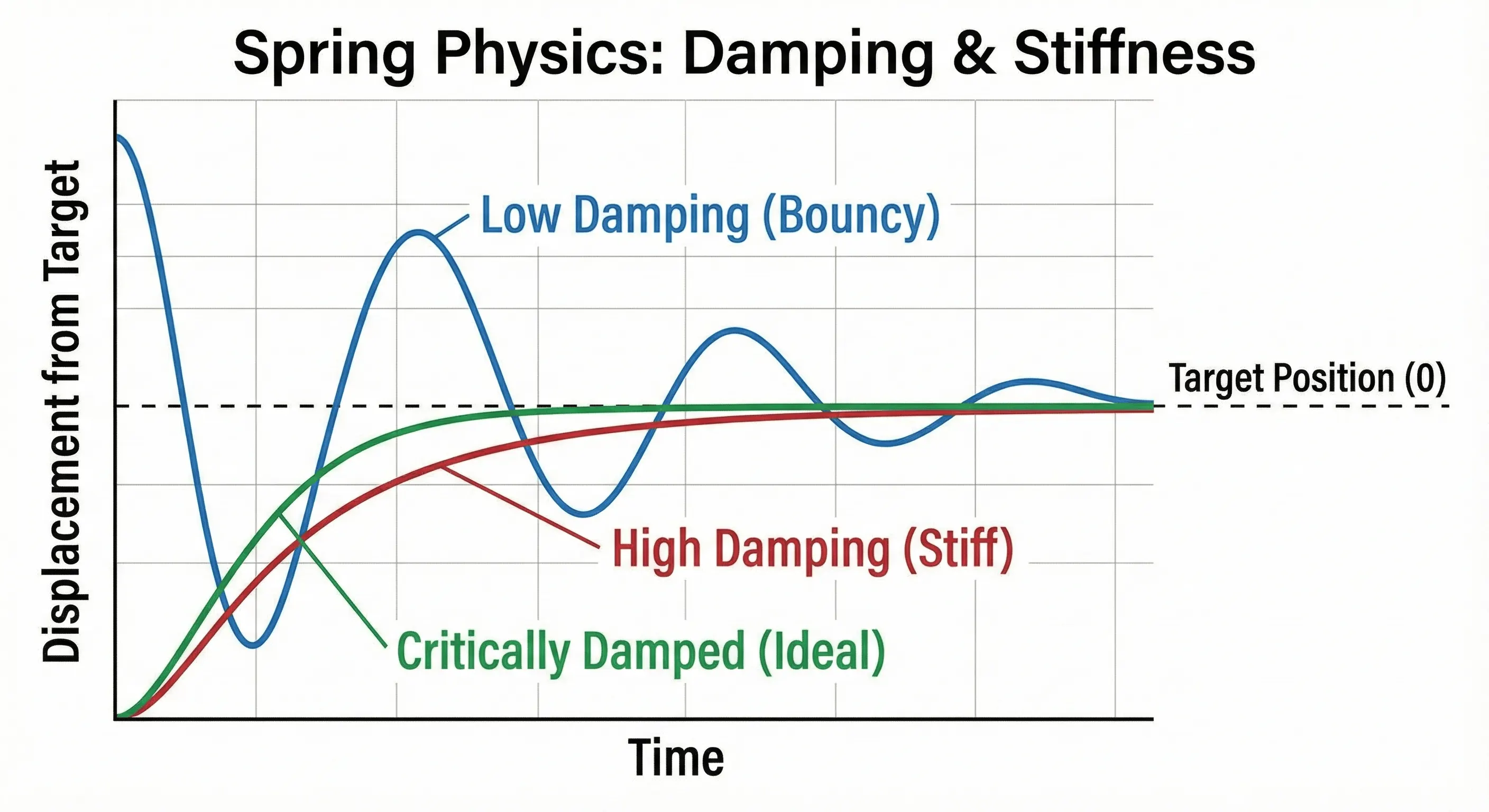
// ✅ Good: Reasonable spring values
<motion.div
  animate={{ x: 100 }}
  transition={{
    type: "spring",
    stiffness: 300,  // 100-500 is typical
    damping: 25      // 10-40 is typical
  }}
/>

// ❌ Problematic: Very high stiffness causes many frames
<motion.div
  animate={{ x: 100 }}
  transition={{
    type: "spring",
    stiffness: 10000,  // Too high
    damping: 5         // Too low (bouncy)
  }}
/>
Transform Origin
When animating scale or rotate, the transform-origin determines the pivot point. By default, transforms originate from the element’s center. Override with the style prop:
// Scale from top-left corner
<motion.div
  style={{ transformOrigin: "top left" }}
  whileHover={{ scale: 1.1 }}
/>

// Rotate from bottom center (like a pendulum)
<motion.div
  style={{ transformOrigin: "bottom center" }}
  animate={{ rotate: [0, 10, -10, 0] }}
  transition={{ repeat: Infinity, duration: 2 }}
/>
Programmatic Control with useAnimationControls
For animations triggered by external events (not React state), use useAnimationControls.
import { motion, useAnimationControls } from "framer-motion";
import { useEffect } from "react";

export function ShakeOnError({ error }: { error: string | null }) {
  const controls = useAnimationControls();

  useEffect(() => {
    if (error) {
      controls.start({
        x: [0, -10, 10, -10, 10, 0],
        transition: { duration: 0.4 },
      });
    }
  }, [error, controls]);

  return (
    <motion.div animate={controls} className="rounded border p-4">
      <input type="text" />
      {error && <p className="text-red-500">{error}</p>}
    </motion.div>
  );
}
React 18/19 Concurrent Mode Compatibility
Framer Motion v10+ is fully compatible with React 18’s Concurrent Mode and Strict Mode. React 19 is fully supported, and the React Compiler can auto-memoize animation components.
Avoid Expensive Effects
Some CSS properties are particularly costly to animate:
// ❌ Expensive: Large blur radius
<motion.div
  animate={{ filter: "blur(50px)" }}  // Very expensive
/>

// ❌ Expensive: Box shadow changes
<motion.div
  animate={{
    boxShadow: "0 25px 50px rgba(0,0,0,0.5)"  // Triggers paint
  }}
/>

// ✅ Better: Animate a pseudo-element's opacity instead
// Pre-render the shadow, then fade it in/out
Accessibility: Respecting Reduced Motion
Users can enable “Reduce Motion” in their operating system settings to minimize animations that may cause discomfort. Framer Motion provides two approaches to respect this preference.
Global Configuration with MotionConfig:
import { MotionConfig } from "framer-motion";

export function App({ children }: { children: React.ReactNode }) {
  return <MotionConfig reducedMotion="user">{children}</MotionConfig>;
}
Setting reducedMotion="user" automatically disables transform and layout animations while preserving opacity and color transitions.
Custom Control with useReducedMotion:
For more granular control, use the useReducedMotion hook:
import { motion, useReducedMotion } from "framer-motion";

export function Sidebar({ isOpen }: { isOpen: boolean }) {
  const shouldReduceMotion = useReducedMotion();

  // Replace slide animation with fade for reduced motion users
  const closedX = shouldReduceMotion ? 0 : "-100%";

  return (
    <motion.aside
      animate={{
        opacity: isOpen ? 1 : 0,
        x: isOpen ? 0 : closedX,
      }}
      transition={{
        duration: shouldReduceMotion ? 0.1 : 0.3,
      }}
      className="fixed left-0 top-0 h-full w-64 bg-gray-900"
    >
      {/* Sidebar content */}
    </motion.aside>
  );
}
Motion Accessibility Checklist:
- Wrap app in
<MotionConfig reducedMotion="user">for automatic handling - Use
useReducedMotion()for custom reduced-motion alternatives - Replace x/y transforms with opacity fades for reduced motion
- Disable parallax and auto-playing animations
- Keep essential transitions (like focus indicators) even with reduced motion
- Test with “Reduce Motion” enabled in your OS settings
Do/Don’t List
| Do | Don’t |
|---|---|
Animate transform and opacity for best performance |
Animate width, height, or margin directly |
Use MotionConfig reducedMotion="user" globally |
Ignore accessibility preferences |
| Extract variants outside components | Define animation objects inline in render |
| Test on real mobile devices | Assume desktop performance equals mobile |
Common Errors and Fixes
Quick reference for the most common Framer Motion issues.
“Cannot read property ‘getContext’ of null” / createContext Error
Cause: Missing "use client" directive in Next.js App Router.
Fix: Add "use client" at the top of any file importing from framer-motion.
Exit Animation Not Playing
Checklist:
- ✅
AnimatePresencewraps the conditional (not inside it) - ✅ Motion component has a unique
keyprop - ✅ Motion component is a direct child of
AnimatePresence
Layout Animation Causes Content to Distort
Fix: Use layout="position" on text and images that shouldn’t scale:
<motion.div layout>
  <motion.img layout="position" src="/avatar.jpg" />
  <motion.h3 layout="position">Title</motion.h3>
</motion.div>
Hydration Mismatch Warning
Fix: Add suppressHydrationWarning or delay animation until after mount:
<motion.div layout suppressHydrationWarning />Variant Inheritance Not Working
Cause: Child has explicit animate prop, breaking inheritance.
Fix: Remove animate from children; only define variants.
Animation Janky on Mobile
Fix:
- Only animate
transformandopacity - Keep spring stiffness 100-500, damping 10-40
- Avoid blur values above 10px
- Test with Chrome DevTools CPU throttling (4x)
useReducedMotion Returns Null
Fix: Handle the null case or use MotionConfig:
const shouldReduceMotion = useReducedMotion();
const duration = (shouldReduceMotion ?? false) ? 0.1 : 0.4;
Quick Reference
Essential Imports
// Core
import { motion, AnimatePresence } from "framer-motion";

// Hooks - Values & Transforms
import {
  useMotionValue,
  useTransform,
  useSpring,
  useVelocity,
} from "framer-motion";

// Hooks - Scroll & View
import { useScroll, useInView } from "framer-motion";

// Hooks - Animation Control
import {
  useAnimate,
  useAnimationControls,
  useReducedMotion,
} from "framer-motion";

// Optimization
import { LazyMotion, domAnimation, domMax, m } from "framer-motion";

// Layout
import { LayoutGroup, Reorder } from "framer-motion";

// Config
import { MotionConfig } from "framer-motion";

// Utilities
import { animate, stagger } from "framer-motion";
Core Props
| Prop | Type | Description |
|---|---|---|
initial |
object | string | false | Starting animation state |
animate |
object | string | Target animation state |
exit |
object | string | Exit animation (requires AnimatePresence) |
transition |
object | Animation timing/physics config |
variants |
object | Named animation states |
layout |
boolean | “position” | “size” | Enable layout animations |
layoutId |
string | Shared element transitions |
whileHover |
object | Animation on hover |
whileTap |
object | Animation on press |
whileInView |
object | Animation when in viewport |
whileDrag |
object | Animation while dragging |
whileFocus |
object | Animation when focused |
drag |
boolean | “x” | “y” | Enable dragging |
dragConstraints |
object | RefObject | Drag boundaries |
onAnimationComplete |
function | Callback when animation finishes |
Hooks Reference
| Hook | Purpose | Returns |
|---|---|---|
useMotionValue(initial) |
Create animatable value outside React state | MotionValue |
useTransform(value, input, output) |
Derive one motion value from another | MotionValue |
useSpring(value, config) |
Add spring physics to a motion value | MotionValue |
useVelocity(value) |
Track velocity of a motion value | MotionValue |
useScroll(options) |
Track scroll progress | { scrollX, scrollY, scrollXProgress, scrollYProgress } |
useInView(ref, options) |
Detect element visibility | boolean |
useAnimate() |
Imperative animation control | [scope, animate] |
useAnimationControls() |
Programmatic animation triggers | AnimationControls |
useReducedMotion() |
Check user’s motion preference | boolean | null |
Transition Types
// Spring (default for physical properties)
transition={{ type: "spring", stiffness: 300, damping: 25, mass: 1 }}

// Tween (duration-based)
transition={{ type: "tween", duration: 0.3, ease: "easeOut" }}
transition={{ type: "tween", duration: 0.5, ease: [0.43, 0.13, 0.23, 0.96] }} // Custom bezier

// Inertia (for drag momentum)
transition={{ type: "inertia", velocity: 50, power: 0.8 }}

// Keyframes
animate={{ x: [0, 100, 50] }}
transition={{ duration: 1, times: [0, 0.5, 1], ease: "easeInOut" }}

// Stagger (with animate function)
animate("li", { opacity: 1 }, { delay: stagger(0.1) })
AnimatePresence Modes
| Mode | Behavior | Use Case |
|---|---|---|
"sync" (default) |
Enter and exit run simultaneously | Crossfade effects |
"wait" |
Exit completes before enter starts | Page transitions |
"popLayout" |
Exiting elements removed from layout flow | List item removal |
Performance Tiers
| Tier | Properties | Performance |
|---|---|---|
| S-Tier | opacity, transform (x, y, scale, rotate) |
GPU compositor, 60fps |
| A-Tier | filter (small values), clipPath |
Paint only, usually smooth |
| C-Tier | backgroundColor, borderRadius |
Paint, may cause jank |
| D-Tier | width, height, margin, padding |
Layout + Paint, avoid |
Recommended Video Resources
For visual learners, these videos complement this guide:
Key Takeaways
- Replace
<div>with<motion.div>and addinitial,animate,transitionprops - Use variants for orchestrated animations across parent-child components with
staggerChildren - AnimatePresence requires three things: wrap the conditional, unique key, direct child
- Layout prop enables automatic FLIP animations. Use
layout="position"for text/images - Stick to transform and opacity for 60fps performance on mobile
- Use
MotionConfig reducedMotion="user"for automatic accessibility compliance - LazyMotion cuts bundle size in half. Use
domAnimation(about 15kb) for most apps
What to Build Next
Now that you understand Framer Motion’s core patterns, try building:
- A toast notification system with stacking, dismissal, and smooth reordering (uses
AnimatePresence mode="popLayout"+layout) - A shared element transition between a grid and detail view (uses
layoutId) - A scroll-driven parallax hero with multiple layers moving at different speeds (uses
useScroll+useTransform)
Each project exercises different Framer Motion capabilities and will solidify your understanding of when to reach for each tool.
Related Resources:
- Building Interactive UI Components - Accessible React components with animations
- React Performance Optimization - Keep animations performant
- What Is a Design Engineer? - Animation as a design engineering skill
- React Hooks Guide - Master useRef and custom hooks for animations
- Building Design Systems - Standardize animation patterns across your system
Migrating from framer-motion to motion
The framer-motion package was rebranded to motion in late 2024. Migration is straightforward:
Step 1: Install the new package
npm install motion
npm uninstall framer-motion
Step 2: Update imports
// Before:
import { motion, AnimatePresence } from "framer-motion";

// After:
import { motion, AnimatePresence } from "motion/react";
Step 3: Update LazyMotion imports
// Before:
import { LazyMotion, domAnimation } from "framer-motion";

// After:
import { LazyMotion, domAnimation } from "motion/react";
The API surface is identical – no component or prop changes required. You can migrate incrementally by updating imports file by file.
Version Compatibility
Framer Motion was rebranded to “Motion” in late 2024. Both the motion and framer-motion npm packages are available and maintained.
| Version | React Support | Key Features | Notes |
|---|---|---|---|
| v12.x (current) | React 18-19 | Full feature set, improved performance | Recommended for new projects |
| v11.x | React 18 | Stable, production-ready | Safe upgrade from v10 |
| v10.x | React 18 | useAnimate, improved LazyMotion |
Minimum for this guide |
| v6-9 | React 17-18 | Core features, older API | Legacy support |
Migration notes:
- v10+ requires React 18 for full compatibility
- The
motion.devdomain hosts the new documentation - Import paths remain unchanged (
framer-motion) - Most v6+ code works in v12 with minimal changes
Check your version: npm list framer-motion