
94.8% of the top million websites fail basic accessibility tests (WebAIM Million Report). With EAA penalties up to EUR80,000 (enforced June 2025) and WCAG 2.2 now ISO/IEC 40500:2025, accessibility must be a core design constraint.
TL;DR
- Use semantic HTML (
button,nav,main) over genericdivs - Color contrast: 4.5:1 for text, 3:1 for UI components
- Keyboard accessible: Tab, Enter, Space, Escape
- Test with axe DevTools + VoiceOver/NVDA
- Respect
prefers-reduced-motion - Use Radix UI or React Aria
- Touch targets: 44x44 CSS pixels minimum
What is WCAG 2.2?
WCAG (Web Content Accessibility Guidelines) is the W3C standard. Target Level AA for most projects.
| Level | Target |
|---|---|
| A | Minimum - never target alone |
| AA | Default for all projects |
| AAA | Specialized apps, government |
POUR Principles
| Principle | Actions |
|---|---|
| Perceivable | Alt text, 4.5:1 contrast, never rely solely on color |
| Operable | Keyboard access, skip links, touch targets 44px+ |
| Understandable | Clear labels, predictable navigation, error identification |
| Robust | Valid HTML, proper ARIA, screen reader testing |
WCAG 2.2 New Criteria
Level AA:
- 2.5.8 Target Size: Interactive targets at least 24x24px (44x44px recommended)
Level AAA:
- 3.3.9 Accessible Authentication: No object recognition required
Sprint Checklist:
- Audit sticky headers for focus obscuring
- Touch targets 24px minimum (44px recommended)
- Remove CAPTCHA-style authentication
Design System Accessibility: Tokens and Figma
Accessible Color Tokens
// tokens/colors.ts
export const colors = {
  // Semantic tokens with built-in contrast guarantees
  text: {
    primary: "#1a1a1a", // 16.1:1 on white
    secondary: "#525252", // 7.2:1 on white
    tertiary: "#737373", // 4.6:1 on white (minimum for AA)
  },

  background: {
    primary: "#ffffff",
    secondary: "#f5f5f5", // 1.1:1 - decorative only
    elevated: "#ffffff",
  },

  interactive: {
    primary: "#0066cc", // 4.5:1 on white
    primaryHover: "#0052a3", // 5.8:1 on white
    focus: "#0066cc", // Used for focus rings
  },

  status: {
    error: "#c41e3a", // 5.9:1 on white
    errorBackground: "#fef2f2",
    success: "#15803d", // 4.8:1 on white
    successBackground: "#f0fdf4",
  },
} as const;

export const contrastRatios = {
  "text.primary/background.primary": 16.1,
  "text.secondary/background.primary": 7.2,
  "text.tertiary/background.primary": 4.6,
  "interactive.primary/background.primary": 4.5,
} as const;
Contrast Ratio Visual Reference
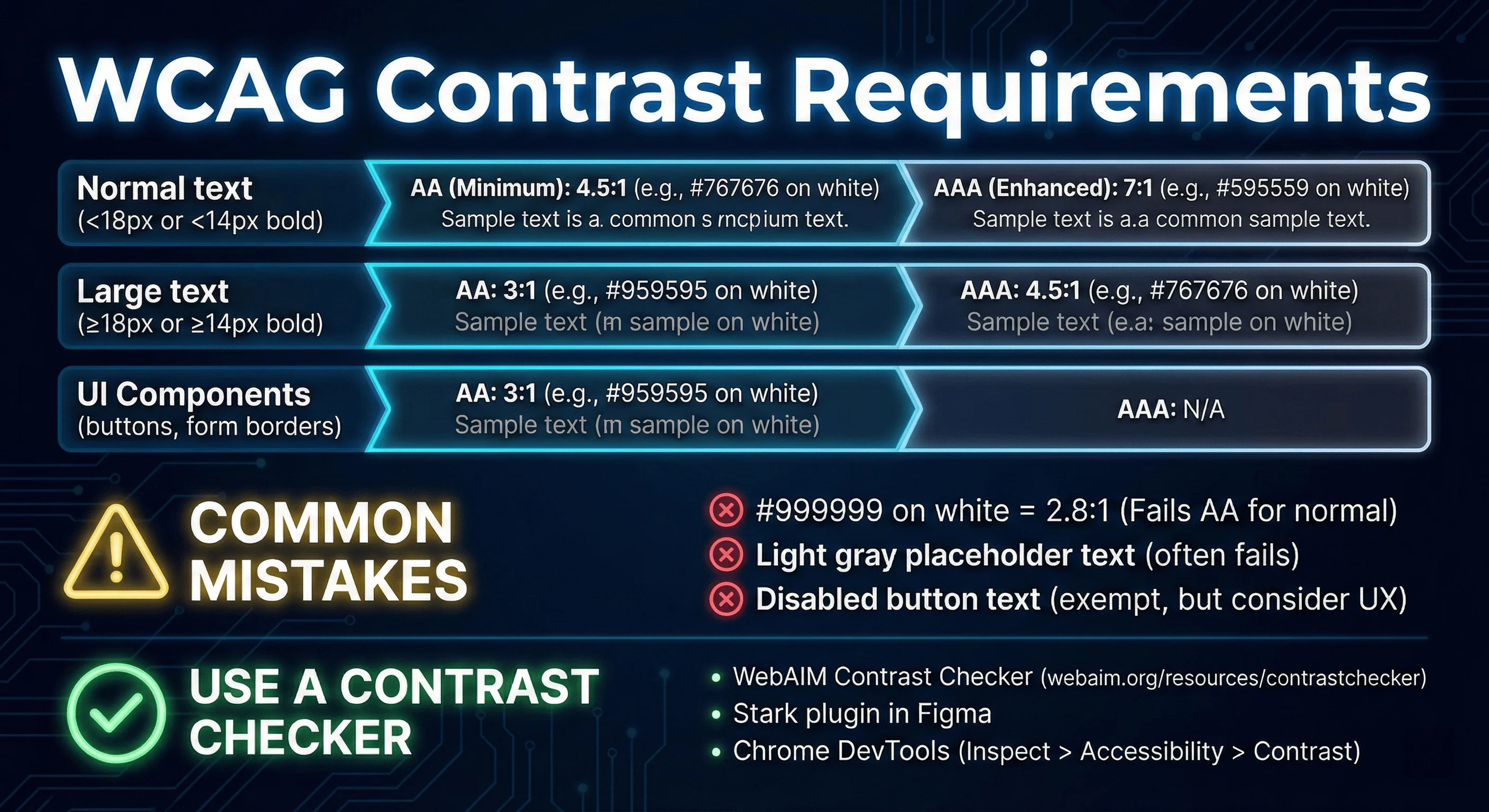
components. Use contrast checkers to verify your color combinations meet accessibility standards.
Figma Accessibility Plugins
| Plugin | Purpose | Cost |
|---|---|---|
| Stark | Contrast checker, vision simulator | Free tier |
| A11y Annotation Kit | Document a11y specs for handoff | Free |
| Able | Contrast checker | Free |
Reduced Motion Tokens
// tokens/motion.ts
export const motion = {
  duration: {
    instant: "0ms",
    fast: "150ms",
    normal: "300ms",
    slow: "500ms",
  },
  easing: {
    default: "cubic-bezier(0.4, 0, 0.2, 1)",
    in: "cubic-bezier(0.4, 0, 1, 1)",
    out: "cubic-bezier(0, 0, 0.2, 1)",
  },
} as const;

// In CSS, always wrap animations
// @media (prefers-reduced-motion: no-preference) { ... }
/* Base: no motion */
.card {
opacity: 1;
transform: translateY(0);
}
@media (prefers-reduced-motion: no-preference) {
.card {
transition:
opacity var(--duration-normal) var(--easing-default),
transform var(--duration-normal) var(--easing-default);
}
.card[data-entering] {
opacity: 0;
transform: translateY(8px);
}
}SVG Icon Accessibility
Decorative Icons (Icon + Text)
Hide decorative icons from screen readers:
// ✅ Correct: Icon is decorative, text provides the label
<button>
    <path d="M5 13l4-4-4-4" />
  </svg>
  Save Changes
</button>

<button>
  <svg role="img" aria-label="Save icon">
    <path d="..." />
  </svg>
  Save Changes
</button>
Informative Icons (Icon-Only Buttons)
<button aria-label="Save changes">
  <svg aria-hidden="true" focusable="false">
    <path d="..." />
  </svg>
</button>

// ✅ Also correct: Visually hidden text
<button>
  <svg aria-hidden="true" focusable="false">
    <path d="..." />
  </svg>
  <span className="sr-only">Save changes</span>
</button>

<button>
  <svg aria-label="Save changes">
    <path d="..." />
  </svg>
</button>
Standalone SVGs (Charts, Diagrams)
For informational SVGs, use <title> and <desc>:
// ✅ Correct: SVG as content with title and description
  <desc id="chart-desc">
    with revenue growing from $2M to $2.8M
  </desc>
  <!-- chart content -->
</svg>

// For complex data visualizations, also provide a data table
<details>
  <summary>View data table</summary>
  <table>
    <caption>Q4 2025 Sales Data</caption>
    <!-- accessible table markup -->
  </table>
</details>
Icon Libraries
| Library | Accessibility | Notes |
|---|---|---|
| Lucide | Excellent | React components with proper ARIA |
| Phosphor Icons | Good | Accessible SVG sprites |
| Material Icons | Mixed | Font-based icons need extra care |
Common SVG Mistakes
| Mistake | Fix |
|---|---|
aria-label on SVG instead of button | Put aria-label on the button |
Missing focusable="false" | Always add focusable="false" |
| Complex SVG without text alternative | Provide data table or description |
Tooltip Accessibility
Requirements:
- Trigger must be focusable
- Appears on hover AND focus
- Closes with Escape key
- Use
role="tooltip"andaria-describedby
Implementation
import { useState, useId } from "react";

function AccessibleTooltip({ trigger, content }) {
  const [isOpen, setIsOpen] = useState(false);
  const tooltipId = useId();

  const handleKeyDown = (e: KeyboardEvent) => {
    if (e.key === "Escape") {
      setIsOpen(false);
    }
  };

  return (
    <>
      <button
        aria-describedby={isOpen ? tooltipId : undefined}
        onMouseEnter={() => setIsOpen(true)}
        onMouseLeave={() => setIsOpen(false)}
        onFocus={() => setIsOpen(true)}
        onBlur={() => setIsOpen(false)}
        onKeyDown={handleKeyDown}
        className="tooltip-trigger"
      >
        {trigger}
      </button>
      {isOpen && (
          {content}
        </div>
      )}
    </>
  );
}

// Usage
<AccessibleTooltip
  trigger={<InfoIcon />}
/>;
Tooltip vs Popover
| Feature | Tooltip | Popover |
|---|---|---|
| Content | Text only | Links, buttons, forms |
| Trigger | Hover/focus | Click/tap |
| Dismissal | Automatic | Manual |
| ARIA | role="tooltip" | role="dialog" |
Rule: If it contains interactive elements, use a popover.
Tooltip Libraries
Use Radix UI Tooltip instead of building from scratch.
Semantic HTML vs ARIA
The Accessibility Tree
The accessibility tree exposes:
- Role: What the element is (button, link, heading)
- Name: The accessible label
- Value: Current value for inputs
<!-- DOM -->
<div class="card">
  <div class="card-image">
  </div>
  <div class="card-content">
    <h3>Running Shoes</h3>
    <p>Lightweight and breathable</p>
    <button>Add to cart</button>
  </div>
</div>

<!-- Accessibility Tree (simplified) -->
<!--
  - img: "Blue running shoes, side view"
  - heading level 3: "Running Shoes"
  - text: "Lightweight and breathable"
  - button: "Add to cart"
-->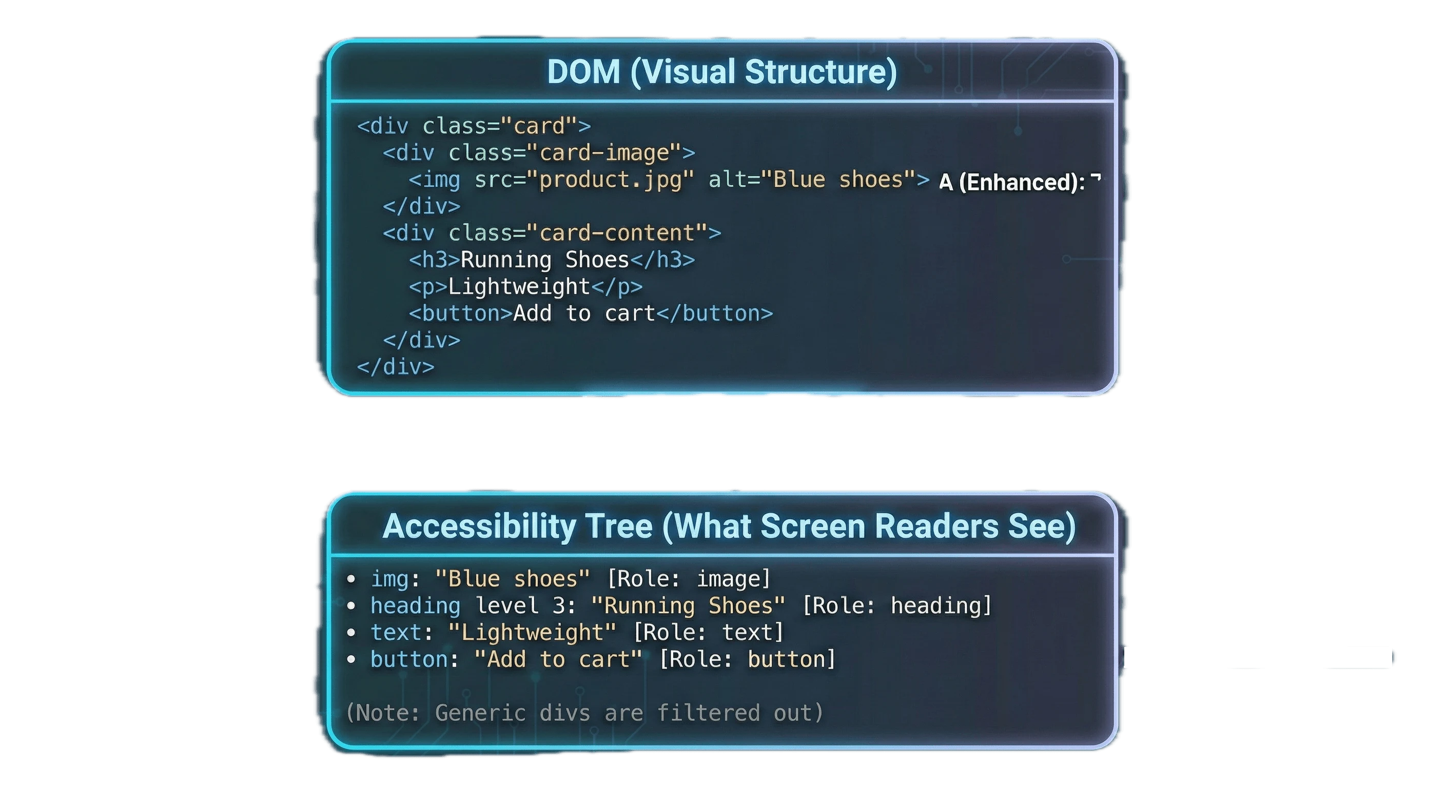
The browser filters the DOM, removing generic divs and keeping only semantic elements for the accessibility tree that screen readers navigate.
Viewing the Accessibility Tree
Chrome/Edge: DevTools > Elements > Select element > Accessibility tab
Firefox: DevTools > Accessibility tab
What to Look For:
- Images have alt text or are marked decorative
- Headings are in logical order (h1, h2, h3)
- No generic roles (div, span) in interactive areas
- No missing accessible names on focusable elements
Accessible Name Priority
aria-labelledby- Reference existing textaria-label- Provides a string label- Element content - Button text, link text
titleattribute - Last resort
Common ARIA Mistakes
| Mistake | Fix |
|---|---|
<div role="button"> | Use <button> |
role="link" without href | Use <a href="..."> |
aria-hidden="true" on focusable | Remove from tab order first |
Redundant role="button" on <button> | Remove the role |
When ARIA is Necessary
<!-- 1. Icon buttons need accessible names -->
<button aria-label="Close dialog">
  <svg aria-hidden="true"><!-- X icon --></svg>
</button>

<!-- 2. Multiple landmarks need distinction -->
<nav aria-label="Main navigation">...</nav>
<nav aria-label="Footer navigation">...</nav>

<!-- 3. Dynamic content needs live regions -->
<div aria-live="polite" aria-atomic="true">
  <span>3 items in cart</span>
</div>

<!-- 4. Custom widgets need full ARIA patterns -->
<div role="tablist" aria-label="Product information">
  <button role="tab" aria-selected="true" aria-controls="panel-1">
    Description
  </button>
    Reviews
  </button>
</div>
<div role="tabpanel" id="panel-1">...</div>
<div role="tabpanel" id="panel-2" hidden>...</div>
Keyboard Navigation Patterns
Keyboard Contract
| Key | Behavior |
|---|---|
| Tab | Move to next focusable element |
| Shift+Tab | Move to previous |
| Enter | Activate buttons, submit forms, follow links |
Roving Tabindex
  const [focusedIndex, setFocusedIndex] = useState(0);

  const handleKeyDown = (event: KeyboardEvent, index: number) => {
    let newIndex = index;

    switch (event.key) {
      case "ArrowRight":
        newIndex = (index + 1) % tabs.length;
        break;
      case "ArrowLeft":
        newIndex = (index - 1 + tabs.length) % tabs.length;
        break;
      case "Home":
        newIndex = 0;
        break;
      case "End":
        newIndex = tabs.length - 1;
        break;
      default:
        return;
    }

    event.preventDefault();
    setFocusedIndex(newIndex);
    tabRefs.current[newIndex]?.focus();
  };

  return (
    <div role="tablist" aria-label="Content sections">
      {tabs.map((tab, index) => (
        <button
          key={tab.id}
          role="tab"
          aria-selected={activeTab === tab.id}
          aria-controls={`panel-${tab.id}`}
          onClick={() => onTabChange(tab.id)}
        >
          {tab.label}
        </button>
      ))}
    </div>
  );
}
Focus Trapping in Modals
Focus trapping prevents keyboard users from tabbing outside an open modal.
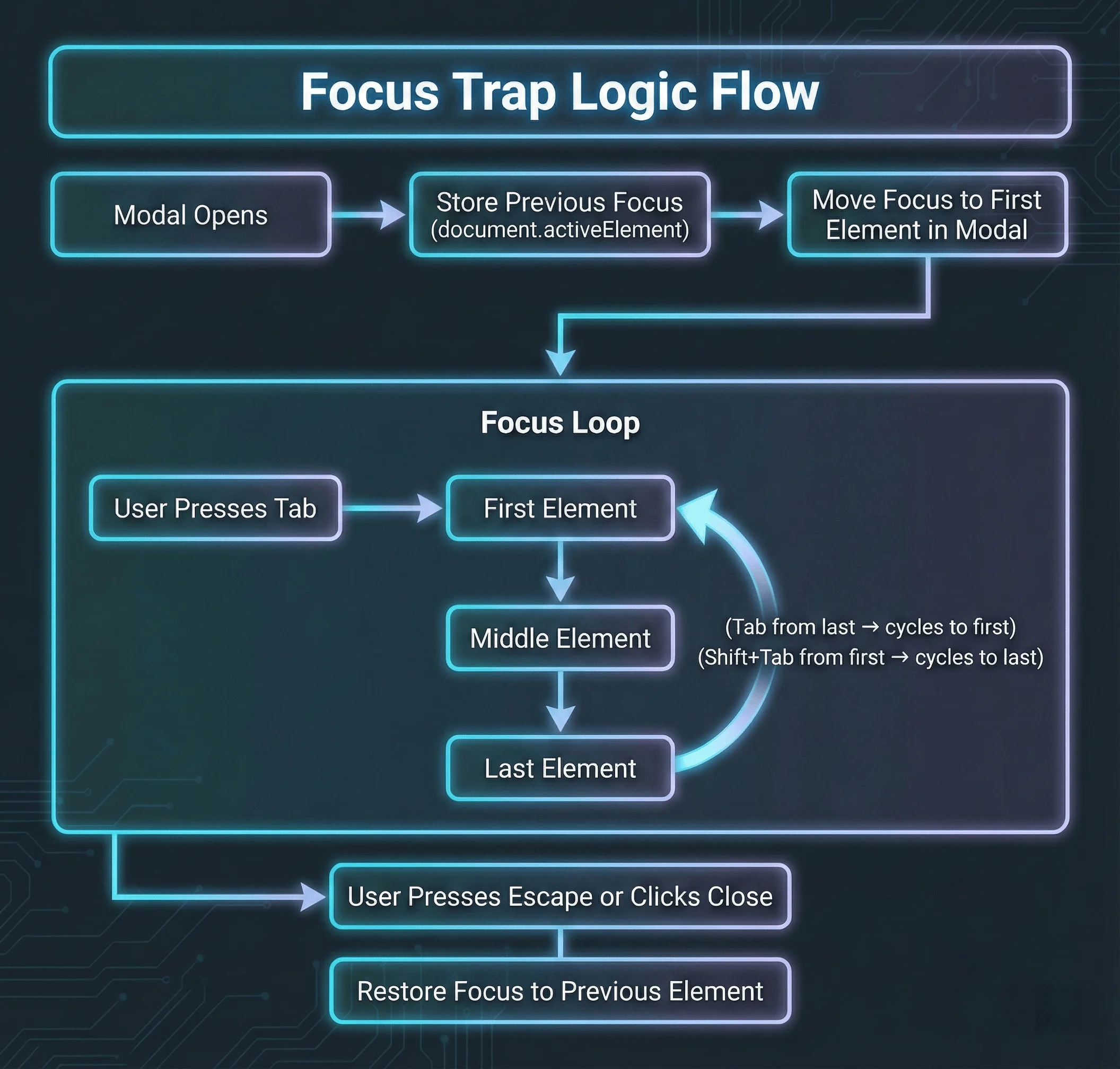
Tab from the last element returns to the first. Escape closes the modal.
  const modalRef = useRef<HTMLDivElement>(null);
  const previousFocus = useRef<HTMLElement | null>(null);

  useEffect(() => {
    if (isOpen) {

      // Focus first focusable element or the modal itself
      const focusable = modalRef.current?.querySelectorAll<HTMLElement>(
      );

      if (focusable?.length) {
        focusable[0].focus();
      } else {
        modalRef.current?.focus();
      }
    } else if (previousFocus.current) {
      previousFocus.current.focus();
    }
  }, [isOpen]);

  useEffect(() => {
    if (!isOpen) return;

      if (event.key === "Escape") {
        onClose();
        return;
      }

      if (event.key !== "Tab") return;

      const focusable = modalRef.current?.querySelectorAll<HTMLElement>(
      );

      if (!focusable?.length) return;

      const first = focusable[0];
      const last = focusable[focusable.length - 1];

      if (event.shiftKey && document.activeElement === first) {
        event.preventDefault();
        last.focus();
        event.preventDefault();
        first.focus();
      }
    };

    return () => document.removeEventListener("keydown", handleKeyDown);
  }, [isOpen, onClose]);

  return modalRef;
}

// Usage
function Modal({ isOpen, onClose, title, children }) {

  if (!isOpen) return null;

  return (
    <div className="modal-overlay" onClick={onClose}>
      <div
        ref={modalRef}
        role="dialog"
        aria-modal="true"
        aria-labelledby="modal-title"
        tabIndex={-1}
        onClick={(e) => e.stopPropagation()}
      >
        <h2 id="modal-title">{title}</h2>
        {children}
        <button onClick={onClose}>Close</button>
      </div>
    </div>
  );
}
The Native <dialog> Element
  useEffect(() => {
    const dialog = dialogRef.current;
    if (!dialog) return;

    if (isOpen) {
    } else {
      dialog.close();
    }
  }, [isOpen]);

  return (
    <dialog ref={dialogRef} onClose={onClose}>
      {children}
      <button onClick={onClose}>Close</button>
    </dialog>
  );
}
What <dialog> gives you for free:
- Focus trapping (no custom implementation needed)
Escapekey closes the dialog- Background content becomes inert automatically
::backdroppseudo-element for overlay styling- Proper
role="dialog"semantics
When you still need a custom modal: When you need animations (dialog doesn’t animate natively), nested modals, or non-modal drawer patterns.
Focus Not Obscured: WCAG 2.2’s Trickiest New Criterion
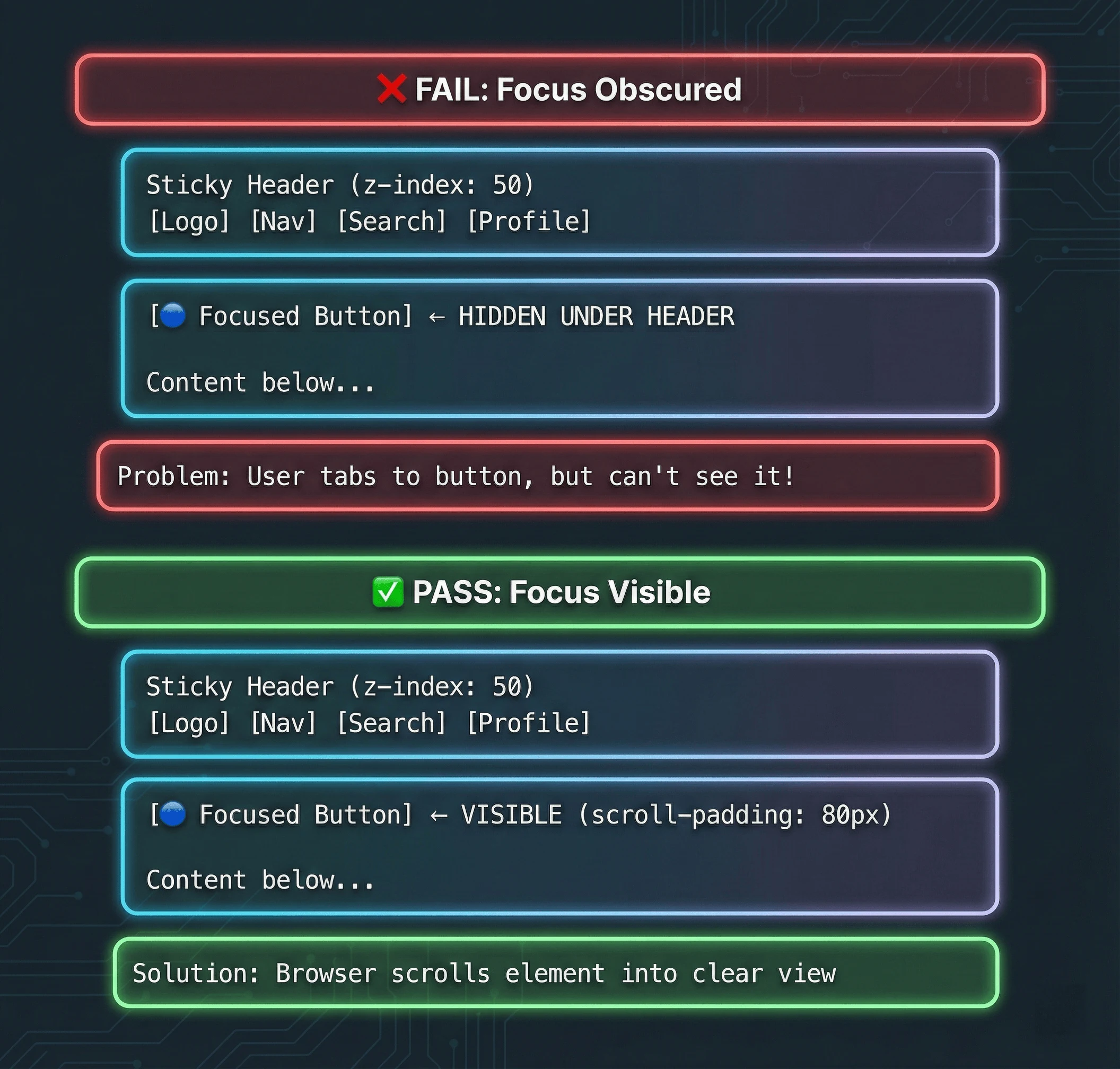
Without scroll-padding, focused elements can be hidden behind sticky headers (fail). With scroll-padding, the browser automatically scrolls elements into the visible area (pass).
// ❌ Problem: Sticky header obscures focused elements
function Layout({ children }) {
  return (
    <>
        <nav>...</nav>
      </header>
      <main className="pt-16">
        {children} {/* First focusable element hidden under header */}
      </main>
    </>
  );
}

function Layout({ children }) {
  return (
    <>
      <header className="fixed top-0 z-50 h-16 bg-white">
        <nav>...</nav>
      </header>
      <main className="pt-16" style={{ scrollPaddingTop: "80px" }}>
        {children}
      </main>
    </>
  );
}
/* Global fix for sticky headers */
html {
scroll-padding-top: 80px; /* Height of sticky header + buffer */
}
/* For cookie banners at bottom */
html {
scroll-padding-bottom: 100px;
}
/* Ensure focus indicators aren't clipped */
*:focus-visible {
outline: 2px solid var(--color-focus);
outline-offset: 2px;
scroll-margin: 80px; /* Ensures element scrolls into view with buffer */
}Testing for Focus Not Obscured:
- Tab through your entire page with a sticky header visible
Drag-and-Drop Accessibility: WCAG 2.5.7
// ❌ Problem: Drag-only reordering
function SortableList({ items, onReorder }) {
  return (
    <DragDropContext onDragEnd={onReorder}>
      <Droppable droppableId="list">
        {(provided) => (
            {items.map((item, index) => (
              <Draggable key={item.id} draggableId={item.id} index={index}>
                {(provided) => (
                  <li
                    ref={provided.innerRef}
                    {...provided.draggableProps}
                    {...provided.dragHandleProps}
                  >
                    {item.name}
                  </li>
                )}
              </Draggable>
            ))}
          </ul>
        )}
      </Droppable>
    </DragDropContext>
  );
}

// ✅ Solution: Drag + keyboard alternative
    const newIndex = direction === "up" ? index - 1 : index + 1;

    const newItems = [...items];
    [newItems[index], newItems[newIndex]] = [
      newItems[newIndex],
      newItems[index],
    ];
    onReorder(newItems);
  };

  return (
    <ul role="list" aria-label="Sortable task list">
      {items.map((item, index) => (
        <li key={item.id} className="sortable-item">
          <span>{item.name}</span>
          <div
            className="sort-controls"
            role="group"
            aria-label={`Reorder ${item.name}`}
          >
            <button
              onClick={() => moveItem(index, "up")}
              disabled={index === 0}
              aria-label={`Move ${item.name} up`}
            >
              ↑
            </button>
            <button
              onClick={() => moveItem(index, "down")}
              disabled={index === items.length - 1}
              aria-label={`Move ${item.name} down`}
            >
              ↓
            </button>
          </div>
        </li>
      ))}
    </ul>
  );
}
Note:
react-beautiful-dndwas deprecated by Atlassian in 2024.
Accessible File Upload (Drag + Click Alternative):
function AccessibleFileUpload({ onUpload }) {
  const [isDragging, setIsDragging] = useState(false);

  const handleDrop = (e: DragEvent) => {
    e.preventDefault();
    setIsDragging(false);
    onUpload(files);
  };

    onUpload(files);
  };

  return (
    <div
      onDragOver={(e) => {
        e.preventDefault();
        setIsDragging(true);
      }}
      onDragLeave={() => setIsDragging(false)}
      onDrop={handleDrop}
    >
      <input
        ref={fileInputRef}
        type="file"
        multiple
        onChange={handleFileSelect}
        className="sr-only"
        id="file-upload"
      />
        <UploadIcon aria-hidden="true" />
        <button
          type="button"
          className="upload-button"
        >
          Choose Files
        </button>
      </label>
    </div>
  );
}
Accessible Range Slider (Drag + Keyboard):
// Native input[type="range"] is accessible by default
function AccessibleSlider({ value, onChange, min = 0, max = 100, label }) {
  return (
    <div className="slider-container">
        {label}: {value}
      </label>
      <input
        id="slider"
        type="range"
        min={min}
        max={max}
        value={value}
        onChange={(e) => onChange(Number(e.target.value))}
        aria-valuemin={min}
        aria-valuemax={max}
        aria-valuenow={value}
        aria-label={label}
      />
    </div>
  );
}
The inert Attribute: Modern Focus Management
What is the inert attribute?
The inert attribute is a global HTML attribute (added in 2023) that makes an element and all its descendants non-interactive.
When an element is inert:
- Cannot receive focus (keyboard or programmatic)
- Cannot be clicked or tapped
- Excluded from the accessibility tree
- Excluded from find-in-page searches
- All descendants are also inert
When to Use inert
function Modal({ isOpen, onClose, children }) {
  useEffect(() => {
    if (isOpen) {
      appRoot?.setAttribute("inert", "");
    } else {
      appRoot?.removeAttribute("inert");
    }
  }, [isOpen]);

  if (!isOpen) return null;

  return (
      <h2 id="modal-title">Settings</h2>
      {children}
      <button onClick={onClose}>Close</button>
    </div>
  );
}
function MultiStepForm({ currentStep }) {
return (
<div>
<div inert={currentStep !== 1 ? "" : undefined}>
<Step1 />
</div>
<Step2 />
</div>
<Step3 />
</div>
</div>
);
}function Accordion({ isOpen, children }) {
return (
<div>
<button onClick={toggle} aria-expanded={isOpen}>
Toggle
</button>
{children}
</div>
</div>
);
}inert vs Manual Focus Trapping
| Approach | Pros | Cons |
|---|---|---|
inert attribute | Simple, browser-native, prevents mouse clicks, no JS needed | Requires polyfill for older browsers |
| Manual focus trap | Works in all browsers, fine-grained control | Complex code, easy to get wrong, doesn’t prevent mouse clicks |
Polyfill for Older Browsers
npm install wicg-inertimport "wicg-inert";
// Now inert works in all browsersWhy inert is Better Than aria-hidden:
// ❌ aria-hidden alone doesn't prevent interaction
<div aria-hidden="true">
  <button onClick={handleClick}>
    Still clickable with mouse!
  </button>
</div>

// ✅ inert prevents all interaction
<div inert="">
  <button onClick={handleClick}>
    Cannot click, focus, or interact
  </button>
</div>
Common Use Cases:
- Modal dialogs (mark background as inert)
- Slide-out panels (mark main content as inert)
- Disabled form sections (mark section as inert)
- Off-canvas navigation (mark main content as inert when menu is open)
Skip Links: The Most Forgotten Pattern
<!-- First element in <body> -->

<!-- Later in the page -->
<main id="main-content" tabindex="-1">
  <!-- tabindex="-1" allows programmatic focus -->
</main>
.skip-link {
position: absolute;
top: -40px;
left: 0;
padding: 8px 16px;
background: var(--color-interactive-primary);
color: white;
z-index: 100;
}
.skip-link:focus {
top: 0;
}Screen Reader Testing: A Practical Workflow
Automated tools catch 30-40% of accessibility issues. The rest require manual testing with actual assistive technology.
Which Screen Reader Should You Test With?
| Screen Reader | Platform | Cost | Market Share | Best For |
|---|---|---|---|---|
| NVDA | Windows | Free | ~40% | Primary Windows testing |
| JAWS | Windows | $1000+/year | ~30% | Enterprise compliance |
Recommendation: Test with VoiceOver (if you’re on Mac) and NVDA (install on a Windows VM or machine). These two cover 55%+ of screen reader users and are free.
VoiceOver Quick Reference (macOS)
| Action | Shortcut |
| Toggle VoiceOver | Cmd + F5 |
| Navigate next | Ctrl + Option + Right Arrow |
| Navigate previous | Ctrl + Option + Left Arrow |
| Activate element | Ctrl + Option + Space |
| Open Rotor | Ctrl + Option + U |
NVDA Quick Reference (Windows)
| Action | Shortcut |
|---|---|
| Start NVDA | Desktop shortcut or Ctrl + Alt + N |
| Navigate (browse mode) | Arrow keys |
| Activate element | Enter |
| Tab through forms | Tab |
| Elements list | NVDA + F7 |
| Next heading | H |
| Next landmark | D |
The Screen Reader Testing Checklist
Run through this for every component:
Structure
- Page has exactly one
<h1> - Headings are sequential (h1 → h2 → h3, no skipping)
- Skip link works and focuses main content
Interactive Elements
- All buttons announce their purpose
- Links announce their destination
- Form inputs announce their labels
- Required fields are announced as required
Dynamic Content
- Loading states are announced
- Toast notifications are announced
- Form submission results are announced
- Content changes in SPAs are announced
Images and Media
- Informative images have descriptive alt text
- Decorative images have
alt="" - Complex images have extended descriptions
- Videos have captions
Accessible Component Libraries: Don’t Reinvent the Wheel
Building accessible custom components from scratch is hard.
I spent two weeks building a custom combobox for a project last year before realizing I was reinventing what React Aria already does perfectly.
These libraries handle keyboard navigation, focus management, and ARIA for you:
Which Accessible Component Library Should You Use?
| Library | Framework | Styling | Components | Best For |
|---|---|---|---|---|
| Radix UI Primitives | React | Unstyled | 30+ | Design systems, full control |
| Base UI | React | Unstyled | 20+ | From MUI team, unstyled headless primitives with fresh API design |
| Headless UI | React, Vue | Unstyled | 15+ | Tailwind projects |
Design Engineer Tip: Use Radix Primitives for unstyled, fully accessible, and composable components.
Example: Accessible Dropdown with Radix
function UserMenu() {
  return (
    <DropdownMenu.Root>
      <DropdownMenu.Trigger asChild>
        <button aria-label="User menu">
          <Avatar />
        </button>
      </DropdownMenu.Trigger>

      <DropdownMenu.Portal>
        <DropdownMenu.Content className="dropdown-content" sideOffset={5}>
            Profile
          </DropdownMenu.Item>
          <DropdownMenu.Item className="dropdown-item">
            Settings
          </DropdownMenu.Item>
          <DropdownMenu.Separator className="dropdown-separator" />
            Sign out
          </DropdownMenu.Item>
        </DropdownMenu.Content>
      </DropdownMenu.Portal>
    </DropdownMenu.Root>
  );
}
This gives you:
- Keyboard navigation (arrow keys, Home, End)
- Focus management (focus returns to trigger on close)
- Proper ARIA roles and attributes
- Click outside to close
- Escape to close
- Typeahead search
shadcn/ui: Copy-Paste Accessible Components
It’s not a traditional component library - it’s a collection of copy-paste components built on Radix Primitives and styled with Tailwind CSS.
Why developers love it:
- Built on Radix (fully accessible by default)
- Copy-paste, not npm install (no dependency bloat)
- Tailwind styling (easy to customize)
- 50+ production-ready components
- TypeScript support
- Works with Next.js, Remix, Astro, Vite
When to use shadcn/ui vs Radix directly:
- Use shadcn/ui if you want pre-styled components you can customize
- Use Radix Primitives if you’re building a design system from scratch
- Use Base UI if you want the next-gen Radix with a fresh codebase
- Use React Aria if you need internationalization (30+ languages)
Accessibility in Your Development Workflow
Catching accessibility issues while typing is faster than catching them in code review or production. Here’s how to build accessibility into your development workflow.
eslint-plugin-jsx-a11y: Accessibility Linting for React
Installation:
npm install eslint-plugin-jsx-a11y --save-devConfiguration (.eslintrc.json):
{
  "extends": ["plugin:jsx-a11y/recommended"],
  "plugins": ["jsx-a11y"]
}
What It Catches:
| Rule | What It Prevents | Example |
| label-has-associated-control | Labels without inputs | <label>Email</label> ❌ |
| no-autofocus | Autofocus on page load | <input autoFocus /> ⚠️ |
Real-World Example:
<div onClick={handleClick}>
  Click me
</div>

// ✅ Fixed: Use a button
<button onClick={handleClick}>
  Click me
</button>

<img src="/avatar.jpg" />

// ✅ Fixed: Add alt text
<img src="/avatar.jpg" alt="User profile photo" />

// ❌ ESLint error: "Form label must have associated control"
<label>Email</label>
<input type="email" />

// ✅ Fixed: Associate label with input
<label htmlFor="email">Email</label>
<input id="email" type="email" />
Why This Matters:
- Zero runtime cost: Linting happens at build time
Recommended Rules:
{
  "rules": {
    "jsx-a11y/alt-text": "error",
    "jsx-a11y/anchor-has-content": "error",
    "jsx-a11y/anchor-is-valid": "error",
    "jsx-a11y/aria-props": "error",
    "jsx-a11y/aria-role": "error",
    "jsx-a11y/click-events-have-key-events": "error",
    "jsx-a11y/heading-has-content": "error",
    "jsx-a11y/no-static-element-interactions": "error"
  }
}
Integration with CI/CD:
Modern AI-augmented development workflows can automate accessibility checks alongside other quality gates:
# .github/workflows/ci.yml
name: Accessibility Checks

on: [push, pull_request]

jobs:
  lint:
    runs-on: ubuntu-latest
    steps:
      - uses: actions/checkout@v4
      - uses: actions/setup-node@v4
      - run: npm ci
      - run: npm run lint # Includes jsx-a11y rules
The Complete Accessibility Testing Stack
| -------------------------- | ------------------------------------------------- | ---------------------- | ---- | | eslint-plugin-jsx-a11y | React-specific issues (missing alt, click on div) | While typing | Free | | Lighthouse | Core Web Vitals + accessibility score | CI/CD or manual | Free | | VoiceOver/NVDA | Real screen reader experience | Manual testing | Free |
Recommendation: Use all five.
Animation Accessibility: Respecting Motion Preferences
What Animations Should You Avoid?
| High Risk (Avoid or Gate) | Lower Risk (Usually Safe) | | Parallax scrolling | Opacity fades | | Large-scale zooming | Color transitions | | Spinning/rotating elements | Subtle hover states | | Auto-playing carousels | User-triggered animations | | Flashing (>3 times/second) | Transform: translate (small) |
The prefers-reduced-motion Pattern
/* Default: no animation */
.element {
  opacity: 1;
  transform: translateY(0);
}

/* Only animate if user hasn't requested reduced motion */
@media (prefers-reduced-motion: no-preference) {
  .element {
    transition:
      opacity 0.3s ease,
      transform 0.3s ease;
  }

  .element[data-state="entering"] {
    opacity: 0;
    transform: translateY(8px);
  }
}
Reduced Motion in Framer Motion
If you’re using Framer Motion, use the useReducedMotion hook:
import { motion, useReducedMotion } from "framer-motion";

function AnimatedCard({ children }) {
  const shouldReduceMotion = useReducedMotion();

  const variants = {
    hidden: {
      opacity: 0,
      y: shouldReduceMotion ? 0 : 20,
    },
    visible: {
      opacity: 1,
      y: 0,
      transition: {
        duration: shouldReduceMotion ? 0.01 : 0.3,
      },
    },
  };

  return (
      {children}
    </motion.div>
  );
}
The prefers-contrast Media Query
@media (prefers-contrast: more) {
  :root {
    --border-color: #000;
    --text-secondary: #1a1a1a;
    --bg-subtle: #f0f0f0;
  }

  button,
  input,
  select,
  textarea {
    border: 2px solid #000;
  }
}

@media (prefers-contrast: less) {
  :root {
    --text-primary: #444;
    --bg-primary: #fafafa;
  }
}
Accessible Loading States
function LoadingIndicator() {
  const shouldReduceMotion = useReducedMotion();

  return (
    <div role="status" aria-label="Loading">
      {shouldReduceMotion ? (
      ) : (
        <svg className="spinner" viewBox="0 0 50 50" aria-hidden="true">
          <circle cx="25" cy="25" r="20" fill="none" strokeWidth="4" />
        </svg>
      )}
    </div>
  );
}
Accessibility in Your CI/CD Pipeline
Automated Testing Tools
| ------------------------------ | ----------------- | ------------------- | ---------------------------------- | | axe DevTools | Browser extension | ~30-40% of issues | Manual testing, instant feedback | | axe-core | Library | ~30-40% of issues | Integration into any test runner | | WAVE | Browser extension | ~30-40% of issues | Visual feedback, free | | Accessibility Insights | Browser extension | ~30-40% of issues | Microsoft tool, guided assessments | | Pa11y | CLI | ~30-40% of issues | CI/CD pipelines | | BrowserStack Accessibility | Cloud platform | ~30-40% of issues | Cross-browser testing at scale | | Lighthouse CI | CLI | Subset of axe rules | Performance + a11y together | | jest-axe | Jest matcher | ~30-40% of issues | Unit/integration tests | | cypress-axe | Cypress plugin | ~30-40% of issues | E2E tests | | playwright | Built-in | Basic checks | E2E with accessibility snapshots |
Example: jest-axe in Component Tests
import { render } from "@testing-library/react";
import { axe, toHaveNoViolations } from "jest-axe";
import { Button } from "./Button";

expect.extend(toHaveNoViolations);

describe("Button", () => {
  it("should have no accessibility violations", async () => {

    const results = await axe(container);
    expect(results).toHaveNoViolations();
  });

  it("should have no violations when disabled", async () => {
    const { container } = render(
      <Button onClick={() => {}} disabled>
        Disabled button
      </Button>,
    );

    const results = await axe(container);
    expect(results).toHaveNoViolations();
  });
});
Example: Playwright Accessibility Testing
import { test, expect } from "@playwright/test";
import AxeBuilder from "@axe-core/playwright";

test.describe("Homepage accessibility", () => {
  test("should have no automatically detectable violations", async ({
    page,
  }) => {
    await page.goto("/");

    const results = await new AxeBuilder({ page })
      .withTags(["wcag2a", "wcag2aa", "wcag21aa"])
      .analyze();

    expect(results.violations).toEqual([]);
  });

  test("should have no violations on mobile viewport", async ({ page }) => {
    await page.setViewportSize({ width: 375, height: 667 });
    await page.goto("/");

    const results = await new AxeBuilder({ page }).analyze();
    expect(results.violations).toEqual([]);
  });
});
Storybook Accessibility Addon
// .storybook/main.ts
export default {
  addons: ["@storybook/addon-a11y"],
};
// Button.stories.tsx
import type { Meta, StoryObj } from "@storybook/react";
import { Button } from "./Button";
const meta: Meta<typeof Button> = {
component: Button,
parameters: {
a11y: {
config: {
rules: [{ id: "color-contrast", enabled: true }],
},
},
},
};
export default meta;
export const Primary: StoryObj<typeof Button> = {
args: {
children: "Primary Button",
variant: "primary",
},
};Mobile Accessibility: iOS and Android Patterns
Touch Target Sizing
WCAG 2.2 introduced Success Criterion 2.5.8: Target Size (Minimum) requiring interactive elements to be at least 24×24 CSS pixels.
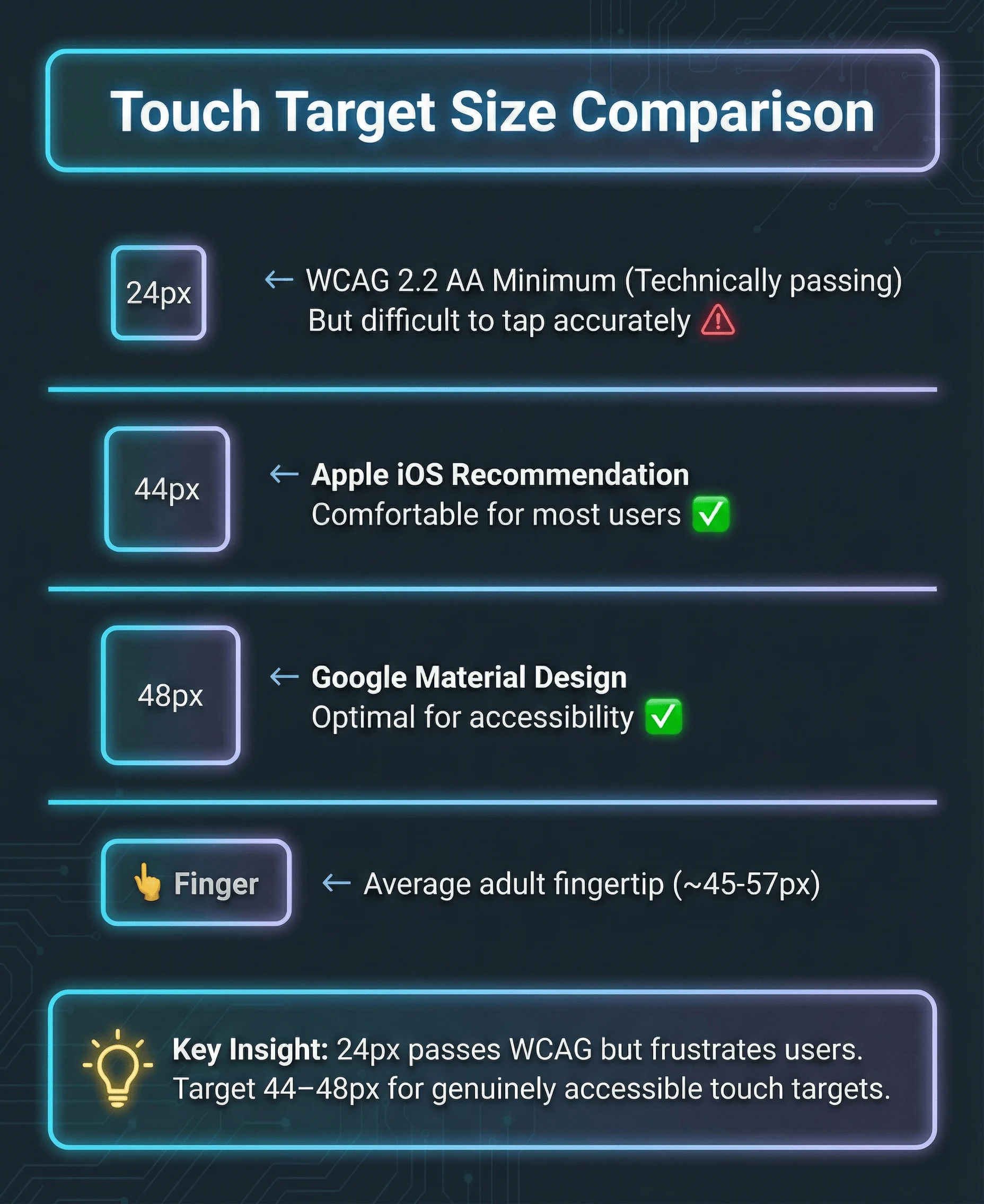
Touch target size comparison: 24px meets WCAG minimum but is difficult to tap accurately. 44-48px provides comfortable interaction for users with varying motor abilities.
/* Minimum (WCAG 2.2 AA) */
.button-minimum {
  min-width: 24px;
  min-height: 24px;
}

/* Recommended (Apple HIG) */
.button-recommended {
  min-width: 44px;
  min-height: 44px;
}

/* Comfortable (Material Design) */
.button-comfortable {
  min-width: 48px;
  min-height: 48px;
  padding: 12px;
}

/* Touch target expansion without visual change */
.icon-button {
  position: relative;
  width: 24px;
  height: 24px;
}

.icon-button::before {
  content: "";
  position: absolute;
  top: 50%;
  left: 50%;
  transform: translate(-50%, -50%);
  width: 44px;
  height: 44px;
}
TalkBack Testing (Android)
| Action | Gesture | | Navigate next | Swipe right | | Navigate previous | Swipe left | | Activate element | Double tap | | Scroll | Two-finger swipe | | Read from top | Swipe down then up | | Stop speaking | Two-finger tap |
TalkBack-specific issues to test:
- Custom gestures must have tap alternatives
- Swipe-to-delete needs an accessible alternative (button or menu)
iOS VoiceOver (Mobile)
Mobile VoiceOver differs from macOS VoiceOver. The gesture-based navigation requires specific testing.
| Action | Gesture | | Enable VoiceOver | Settings > Accessibility > VoiceOver (or triple-click home/side button) | | Navigate next | Swipe right | | Navigate previous | Swipe left | | Activate element | Double tap | | Scroll | Three-finger swipe | | Read from top | Two-finger swipe up | | Stop speaking | Two-finger tap |
iOS-specific patterns:
<div role="group" aria-label="Product: Running Shoes, $89.99">
  <img src="shoes.jpg" alt="" />
  <!-- Empty alt, info in group label -->
  <span aria-hidden="true">Running Shoes</span>
  <span aria-hidden="true">$89.99</span>
</div>

<!-- Trait hints for custom actions -->
  <HeartIcon />
</button>
Gesture Alternatives
| Gesture | Required Alternative | | Swipe to delete | Delete button or menu option | | Pinch to zoom | Zoom buttons (+/-) | | Pull to refresh | Refresh button | | Long press | Context menu button | | Multi-finger gestures | Single tap alternatives | | Drag and drop | Move up/down buttons or select + move action |
// Bad: Swipe-only delete
function SwipeableItem({ onDelete }) {
  return (
    <SwipeableRow onSwipeLeft={onDelete}>
      <ItemContent />
    </SwipeableRow>
  );
}

// Good: Swipe with button alternative
function AccessibleSwipeableItem({ onDelete }) {
  return (
    <SwipeableRow onSwipeLeft={onDelete}>
      <ItemContent />
      <button
        aria-label="Delete item"
        onClick={onDelete}
        className="delete-button"
      >
        <TrashIcon aria-hidden="true" />
      </button>
    </SwipeableRow>
  );
}
Enterprise Compliance: VPAT and ACR Documentation
This isn’t optional for procurement.
What is a VPAT?
A VPAT (Voluntary Product Accessibility Template) is a standardized document that explains how your product conforms to accessibility standards.
- US federal government procurement (Section 508)
- State and local government contracts
- Higher education institutions
- Many Fortune 500 companies
The current version is VPAT 2.5, which covers:
- WCAG 2.2 (Levels A, AA, AAA)
- Revised Section 508 standards
- EN 301 549 (European standard)
What is an ACR?
An ACR (Accessibility Conformance Report) is a completed VPAT.
The VPAT is the template; the ACR is your filled-out assessment.
When someone asks for your “VPAT,” they usually mean your ACR.
Conformance Levels in VPATs
| Level | Meaning | When to Use |
|---|---|---|
| Supports | Fully meets the criterion | Feature works accessibly |
| Partially Supports | Some functionality meets criterion | Document what works and what doesn’t |
| Does Not Support | Does not meet criterion | Be honest, include remediation timeline |
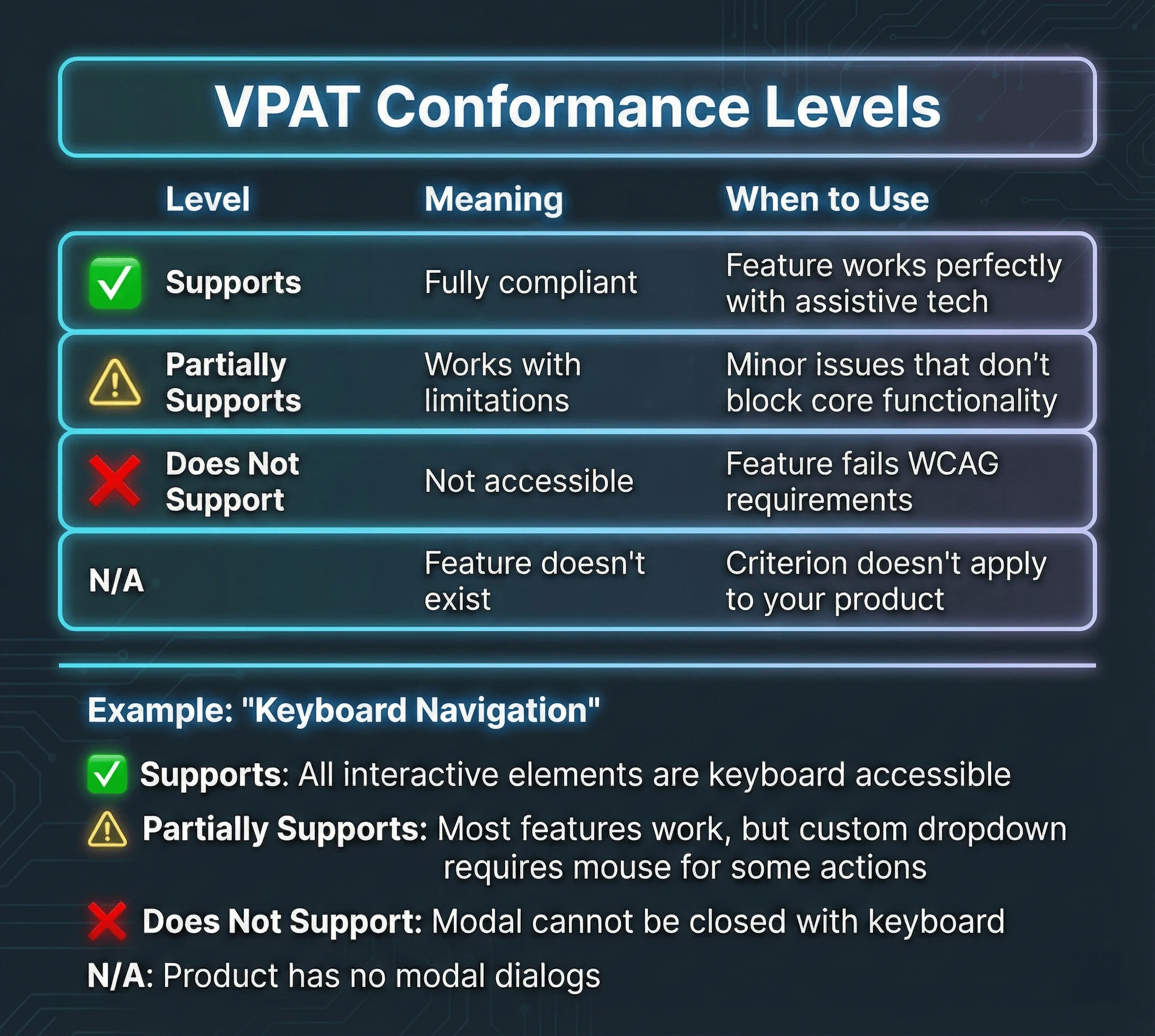
VPAT conformance levels explained with concrete examples. Use “Supports” for for failures, and “N/A” when the criterion doesn’t apply to your product.
Creating Your First ACR
- Audit against WCAG 2.2 AA: Test every criterion, document findings
<!-- Bad remark -->

1.1.1 Non-text Content: Supports

<!-- Good remark -->

1.1.1 Non-text Content: Supports
use null alt attributes. Complex charts include extended descriptions
via aria-describedby linking to detailed text explanations. Icon buttons
use aria-label for accessible names.-
Include testing methodology: List tools used (axe, NVDA, VoiceOver), browser/device combinations tested
-
Update regularly: ACRs should be updated with each major release
Legal Note: Your ACR is a legal document.
Where to Publish Your ACR
- Link from footer on marketing site
- Include in sales/procurement packages
- Register with VPAT Repository for discoverability
The 10 Most Common Accessibility Mistakes
Here are the most common mistakes:
1. Click Handlers on Non-Interactive Elements
// ❌ Wrong: div with click handler
<div onClick={handleClick} className="card">
  Click me
</div>

// ✅ Correct: button element
<button onClick={handleClick} className="card">
  Click me
</button>

// ✅ Also correct: if it navigates, use a link
<a href="/destination" className="card">
  Click me
</a>
Why it matters: Divs aren’t focusable, don’t respond to Enter/Space, and aren’t announced as interactive.
2. Missing Form Labels
// ❌ Wrong: placeholder as label
<input type="email" placeholder="Email address" />

// ❌ Wrong: visual label without association
<span>Email address</span>
<input type="email" />

// ✅ Correct: explicit label
<label htmlFor="email">Email address</label>
<input type="email" id="email" />

// ✅ Also correct: aria-label for icon inputs
<input type="search" aria-label="Search products" />
3. Color as the Only Indicator
// ❌ Wrong: only color shows error state
<input
  type="email"
  className={hasError ? 'border-red' : 'border-gray'}
/>

// ✅ Correct: color + icon + text
<div>
  <input
    type="email"
    aria-invalid={hasError}
    aria-describedby={hasError ? 'email-error' : undefined}
  />
  {hasError && (
    <span id="email-error" className="error">
      <ErrorIcon aria-hidden="true" />
      Please enter a valid email address
    </span>
  )}
</div>
4. Missing Alt Text (or Bad Alt Text)
// ❌ Wrong: missing alt
<img src="product.jpg" />

// ❌ Wrong: useless alt
<img src="product.jpg" alt="image" />
<img src="product.jpg" alt="product.jpg" />

// ❌ Wrong: redundant alt
<img src="product.jpg" alt="Image of a product" />

// ✅ Correct: descriptive alt
<img src="product.jpg" alt="Blue Nike running shoes, side view" />

// ✅ Correct: decorative image
<img src="decorative-swirl.svg" alt="" />
Why it matters: Screen readers announce “image” for missing alt, or read the filename. Neither helps.
5. Removing Focus Indicators
/* ❌ Never do this */
*:focus {
  outline: none;
}

/* ❌ Also bad: removing without replacement */
button:focus {
  outline: none;
}

/* ✅ Correct: custom focus style */
button:focus-visible {
  outline: 2px solid var(--color-focus);
  outline-offset: 2px;
}
Why it matters: Keyboard users can’t see where they are on the page without focus indicators.
6. Incorrect Heading Hierarchy
<!-- ❌ Wrong: skipping levels -->
<h1>Page Title</h1>
<h3>Section Title</h3>
<!-- Skipped h2 -->
<h5>Subsection</h5>
<!-- Skipped h4 -->

<!-- ❌ Wrong: multiple h1s -->
<h1>Site Name</h1>
<h1>Page Title</h1>

<!-- ✅ Correct: sequential hierarchy -->
<h1>Page Title</h1>
<h2>Section Title</h2>
<h3>Subsection</h3>
<h2>Another Section</h2>
Why it matters: Screen reader users navigate by headings. Skipped levels break their mental model.
7. Auto-Playing Media
// ❌ Wrong: auto-playing video
<video autoPlay src="promo.mp4" />

// ❌ Wrong: auto-playing with sound
<video autoPlay src="promo.mp4" />

// ✅ Correct: muted autoplay with controls
<video autoPlay muted controls src="promo.mp4">
</video>

// ✅ Best: no autoplay, user-initiated
<video controls src="promo.mp4">
</video>
8. Inaccessible Modals
// ❌ Wrong: no focus management
function BadModal({ isOpen, children }) {
  if (!isOpen) return null;
  return <div className="modal">{children}</div>;
}

// ✅ Correct: focus trap, escape to close, return focus
function GoodModal({ isOpen, onClose, children }) {
  const modalRef = useFocusTrap(isOpen);

  useEffect(() => {
    const handleEscape = (e) => e.key === "Escape" && onClose();
  }, [onClose]);

  if (!isOpen) return null;

  return (
    <div
      ref={modalRef}
      role="dialog"
      aria-modal="true"
      aria-labelledby="modal-title"
    >
      {children}
    </div>
  );
}
9. Links That Look Like Buttons (and Vice Versa)
<a href="#" onClick={handleSubmit} className="button">
  Submit Form
</a>

// ❌ Wrong: button for navigation
<button onClick={() => router.push('/about')} className="link">
  About Us
</button>

// ✅ Correct: button for actions
<button onClick={handleSubmit} className="button">
  Submit Form
</button>

// ✅ Correct: link for navigation
<a href="/about" className="link">
  About Us
</a>
Why it matters: Screen readers announce “link” vs “button.” Users expect links to navigate and buttons to act.
10. Dynamic Content Without Announcements
// ❌ Wrong: silent update
function BadNotification({ message }) {
  return <div className="toast">{message}</div>;
}

// ✅ Correct: announced update
function GoodNotification({ message }) {
  return (
    <div role="status" aria-live="polite" className="toast">
      {message}
    </div>
  );
}

// ✅ For urgent messages
function AlertNotification({ message }) {
  return (
    <div role="alert" aria-live="assertive" className="toast">
      {message}
    </div>
  );
}
Why it matters: Screen readers don’t automatically announce DOM changes. Live regions fix this.
The Complete Accessibility Checklist
Use this for every component and page you ship:
Design Phase
- Touch targets are at least 24×24px
- Focus states designed for all interactive elements
- Error states don’t rely on color alone
- A11y annotations added for handoff
Development Phase
- Heading hierarchy is logical (h1 → h2 → h3)
- Images have appropriate alt text
- Form inputs have associated labels
- ARIA used only when necessary
- Focus order matches visual order
- Focus indicators are visible
- Skip link implemented
Testing Phase
- axe DevTools shows no violations
- Keyboard-only navigation works
- Screen reader announces content correctly
- Reduced motion preference respected
- 200% zoom doesn’t break layout
- Automated a11y tests pass in CI
What to Do Next
You don’t need to fix everything at once. Here’s a prioritized, time-boxed approach based on what will have the most impact:
Phase 1: This Week (2-3 hours)
Day 1: Install Testing Tools (30 minutes)
- Install WAVE browser extension as a second opinion
- Optional: Install Accessibility Insights for guided assessments
Day 2: Run Your First Audit (1 hour)
- Open your production site’s homepage
- Run axe DevTools scan
- Fix all “Critical” violations (typically 3-5 issues: missing alt text, form labels, color contrast)
Day 3: Test with Keyboard Only (1 hour)
- Unplug your mouse (seriously)
- Navigate your site using only Tab, Enter, Space, and Escape
- Can you reach every interactive element?
- Are focus indicators visible?
- Fix any keyboard traps or missing focus states
Phase 2: This Month (1 day)
Week 1: Add Automated Testing (3 hours)
# Install jest-axe
npm install --save-dev jest-axe @axe-core/react

# Or for Playwright
npm install --save-dev @axe-core/playwright
Write accessibility tests for your 5 most-used components (see examples in the article above). Add to CI pipeline to fail builds on Critical violations.
Week 2: Audit Design Tokens (2 hours)
- Use Stark plugin in Figma to check all color combinations
- Ensure text colors meet 4.5:1 contrast ratio
- Ensure UI components (buttons, inputs) meet 3:1 contrast ratio
- Document passing combinations in your design system
Week 3: Add prefers-reduced-motion (2 hours)
- Wrap all animations in
@media (prefers-reduced-motion: no-preference) - Test by enabling “Reduce motion” in your OS settings
- Ensure critical functionality still works without animation
Week 4: Screen Reader Testing (3 hours)
- Mac: Enable VoiceOver (Cmd+F5), navigate with Ctrl+Option+Arrow keys
- Windows: Install NVDA (free), navigate with arrow keys
- Test 10 key user flows: Can you complete them by listening only?
- Fix issues where content isn’t announced or navigation is confusing
Phase 3: This Quarter (1 week)
Sprint 1: Component Library Migration (2 days)
- Replace custom dropdowns, modals, and tabs with Radix Primitives or shadcn/ui
- Or use React Aria if you need internationalization
- Test each replacement with axe DevTools and screen reader
Sprint 2: Focus Management Audit (1 day)
- Check for Focus Not Obscured issues (WCAG 2.4.11) with sticky headers
- Add
scroll-padding-topandscroll-marginCSS properties - Ensure focus indicators meet 2.4.13 requirements (2px, 3:1 contrast)
Sprint 3: Drag-and-Drop Alternatives (1 day)
- Add keyboard alternatives to sortable lists (up/down buttons)
- Add click alternatives to drag-and-drop file uploads
- Test with keyboard only
Sprint 4: Documentation (1 day)
- Create accessibility checklist for your team (use the one in this article)
- Document accessibility patterns in Storybook or your component library
- Add A11y Annotation Kit to Figma components
Ongoing: Every Sprint (15 minutes per component)
Before merging any PR:
- Run axe DevTools on the changed pages
- Tab through the component with keyboard only
- Test with screen reader (VoiceOver or NVDA) for 5 minutes
- Check color contrast if colors changed
- Verify focus indicators are visible
Monthly:
- Run full accessibility audit with Pa11y or Lighthouse CI
- Review accessibility lawsuit trends (are you at risk?)
- Update team on new WCAG criteria or legal requirements
Resources to Bookmark
Testing Tools:
- axe DevTools - Browser extension
- WAVE - Visual feedback
- Accessibility Insights - Microsoft’s guided assessments
- NVDA - Free Windows screen reader
Component Libraries:
- Radix Primitives - Unstyled, accessible React components
- shadcn/ui - Copy-paste components built on Radix
- React Aria - Adobe’s accessible hooks
- Base UI - Next-gen Radix (2025)
Learning:
- WCAG 2.2 Quick Reference - Official W3C guide
- ARIA Authoring Practices Guide - Patterns and examples
- WebAIM Articles - Practical accessibility guides
The goal isn’t perfection. It’s continuous improvement.
Every accessibility fix you ship makes the web more usable for the 1.3 billion people with disabilities, and for everyone else dealing with situational impairments.
Related Resources:
- Building Design Systems from Scratch - Accessibility integration in design systems
- Framer Motion Complete Guide - Accessible animation patterns
- Building Interactive UI Components - Accessible React components with WCAG compliance
- What Is a Design Engineer? - Accessibility as a design engineering skill
- TypeScript for React Developers - Type-safe accessible component patterns